


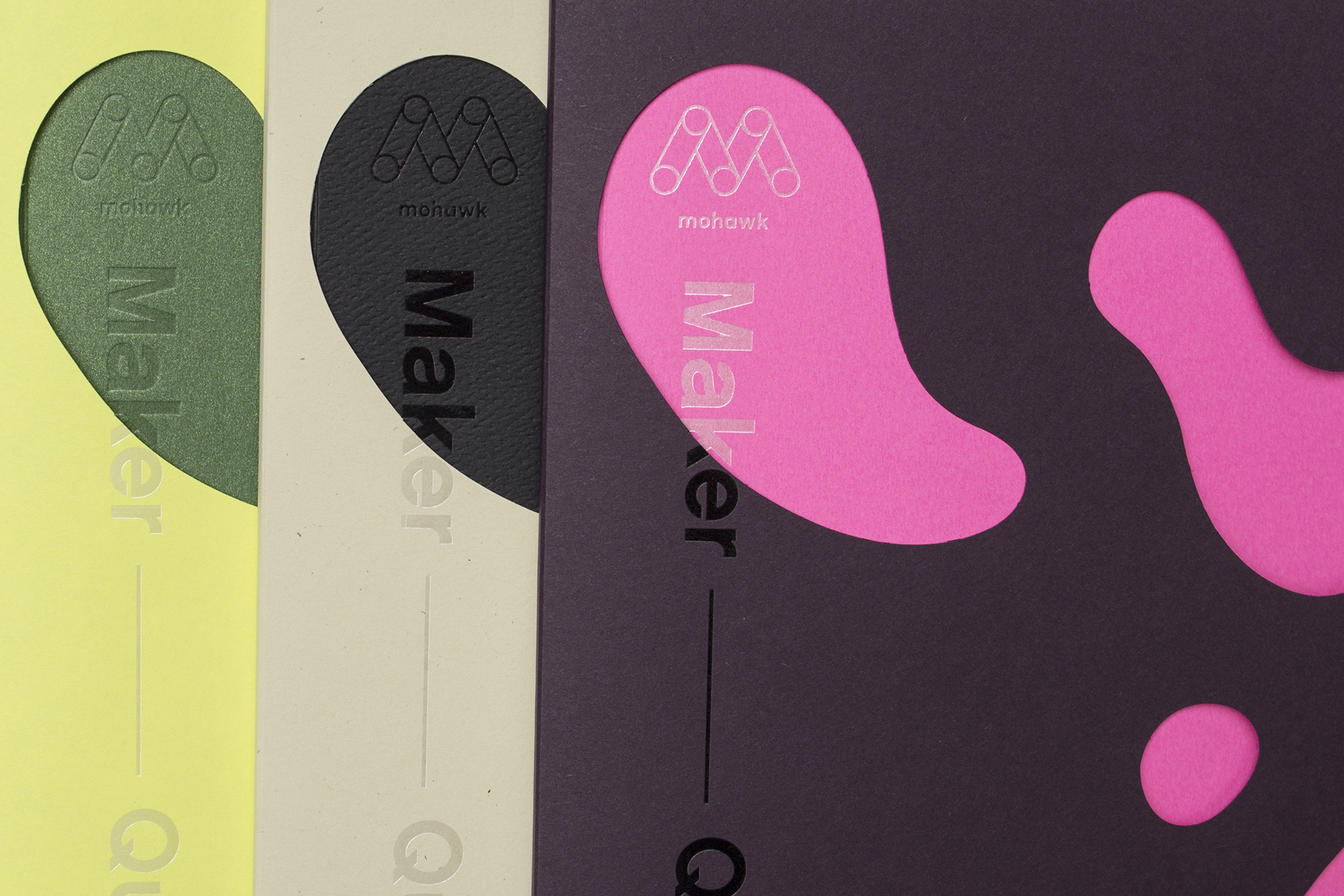
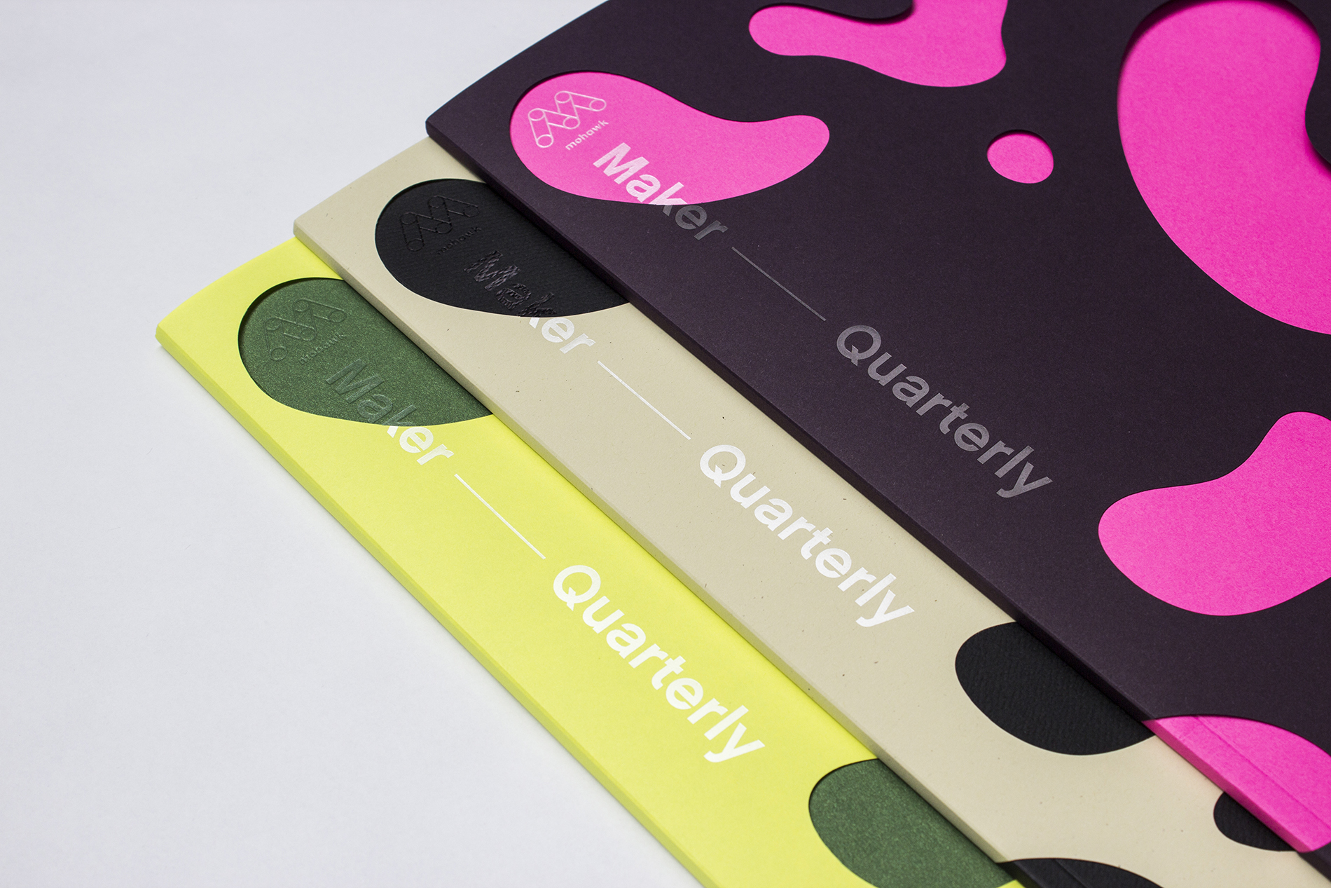
Mohawk Maker Quarterly #12: Partnership
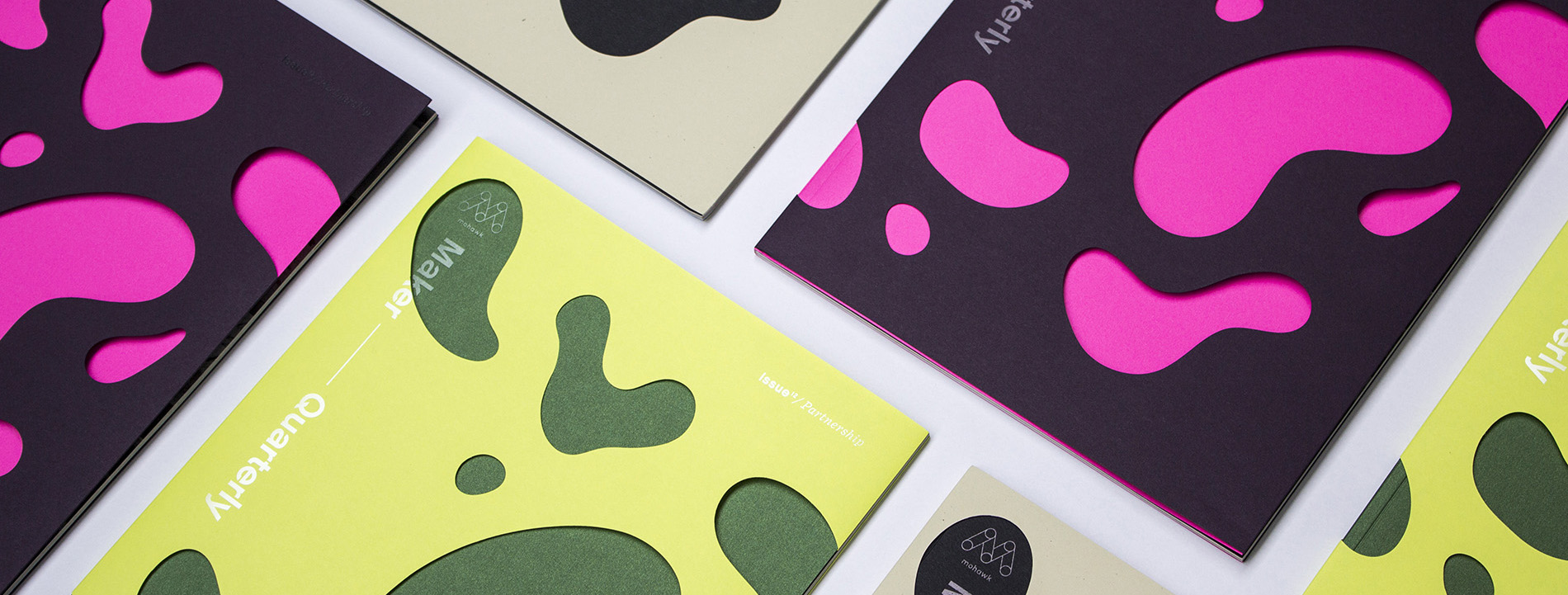
We tend to romanticize the mythology of the solo creative genius. However, humanity’s greatest achievements have happened when people—two or two thousand—worked together.
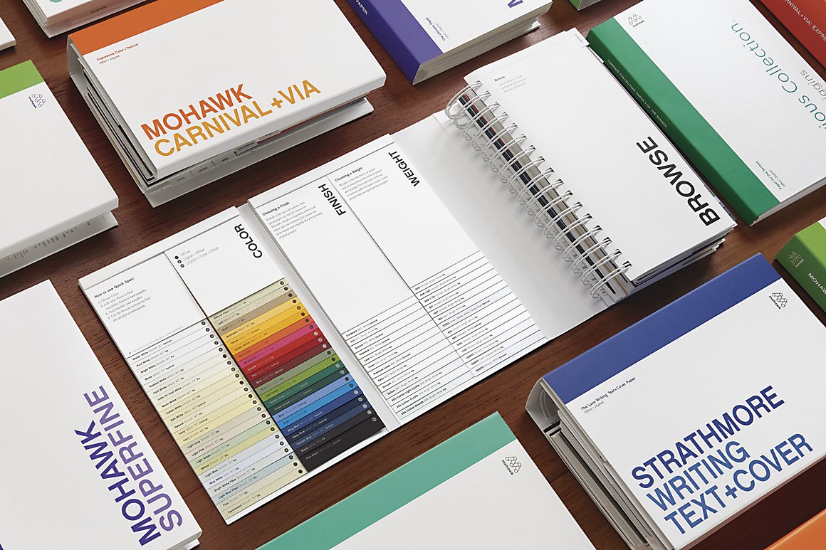
Production Notes
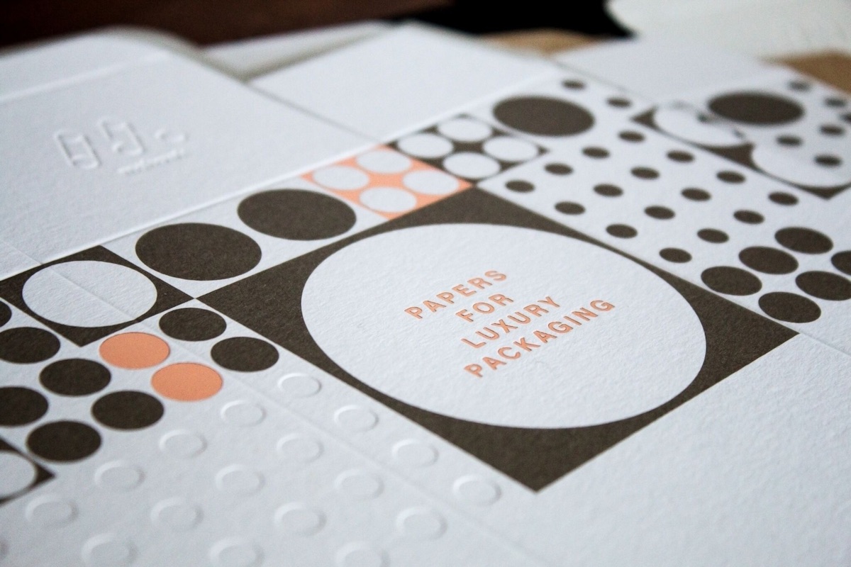
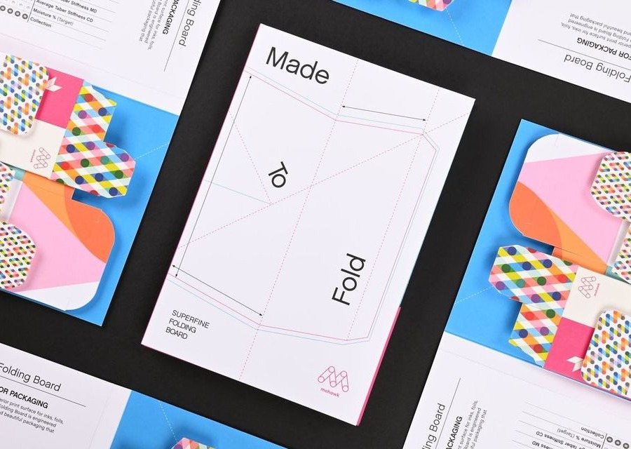
Offset Printing
A commonly used printing technique in which the inked image is transferred from a plate to a rubber blanket, then to the printing surface. When used in combination with the lithographic process, which is based on the repulsion of oil and water, the offset technique employs a flat (planographic) image carrier on which the image to be printed obtains ink from ink rollers, while the non-printing area attracts a water-based film (called "fountain solution"), keeping the non-printing areas ink-free.
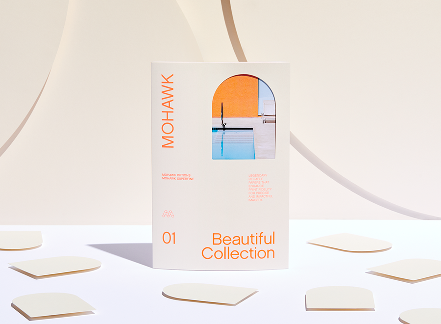
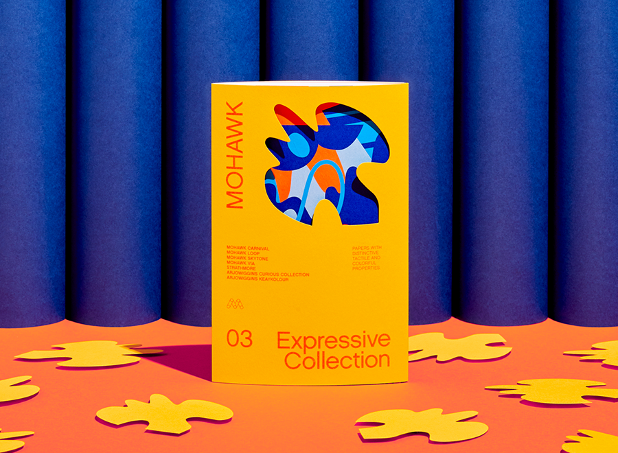
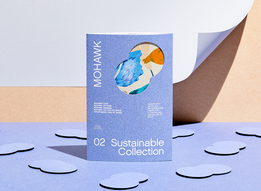
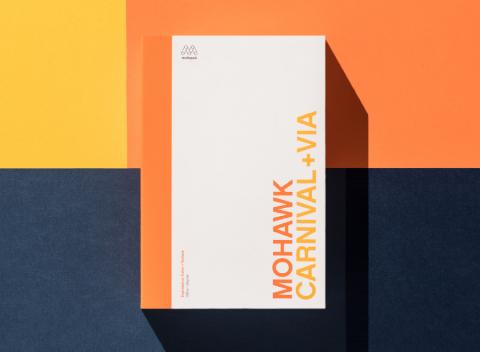
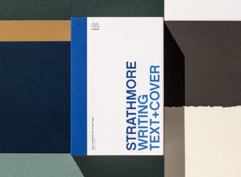
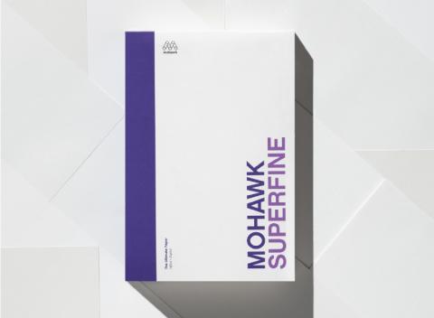
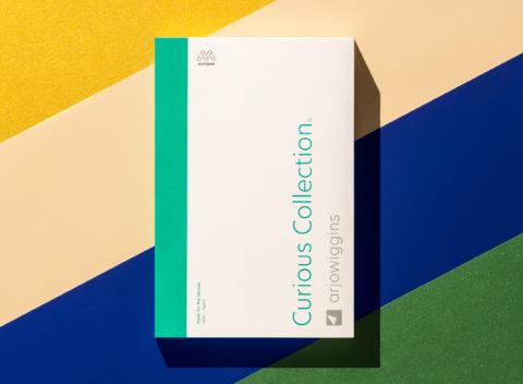
Materials Used
Suggested Articles
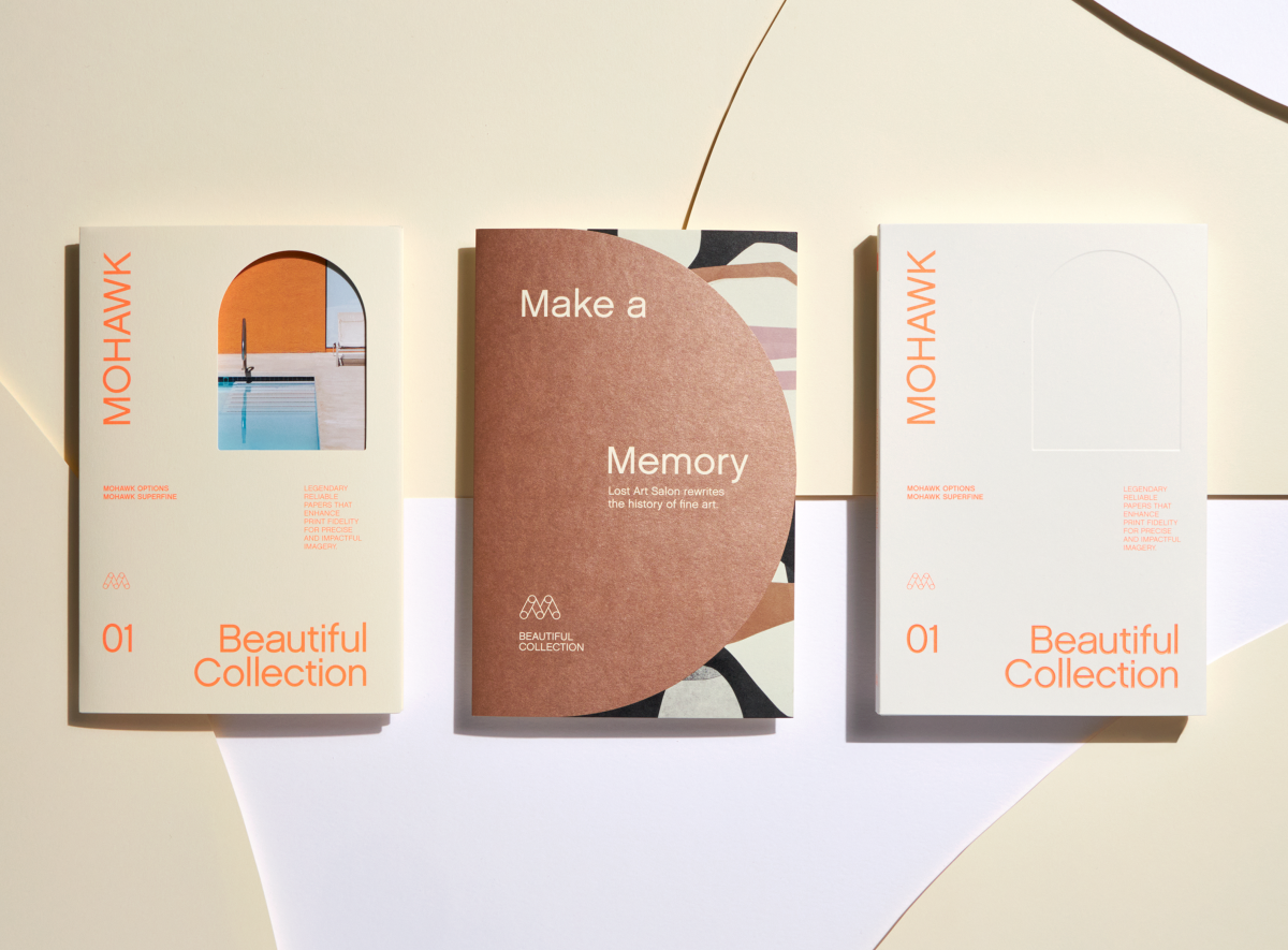
Beauty isn’t a superficial aesthetic trait; it inspires, moves and engages us. It triggers emotion. It attracts. It gives pleasure.
The process of making something — method, materials, ingredients, artistry, experience — is the squiggly line between idea and object. In issue 11 of the Mohawk Maker Quarterly, we celebrate makers who take conscious paths to get from Point A to Point B.
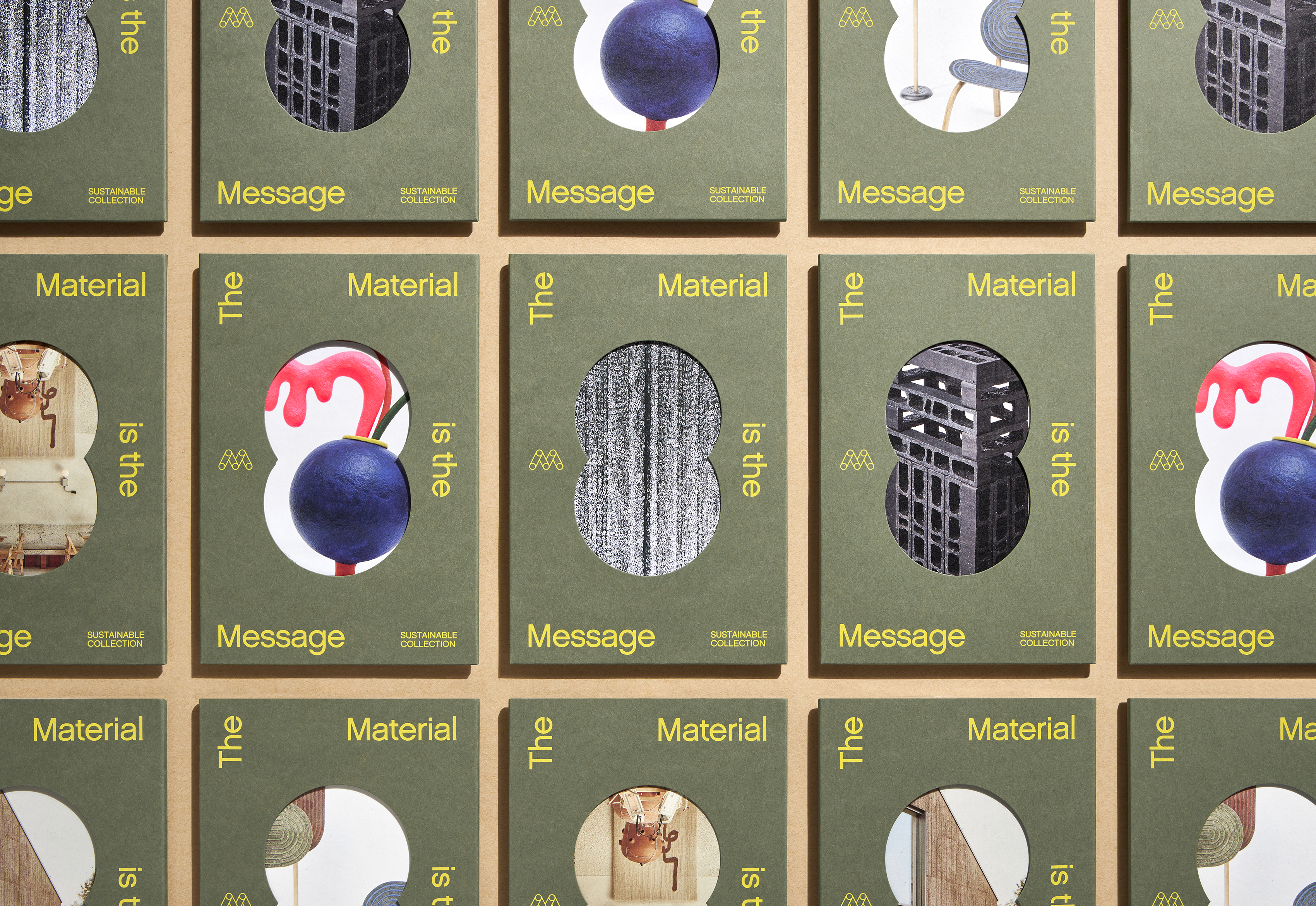
Each issue of the Mohawk Maker Quarterly relies on a single word for its creative framework. In issue thirteen, that word is “disruption.”