


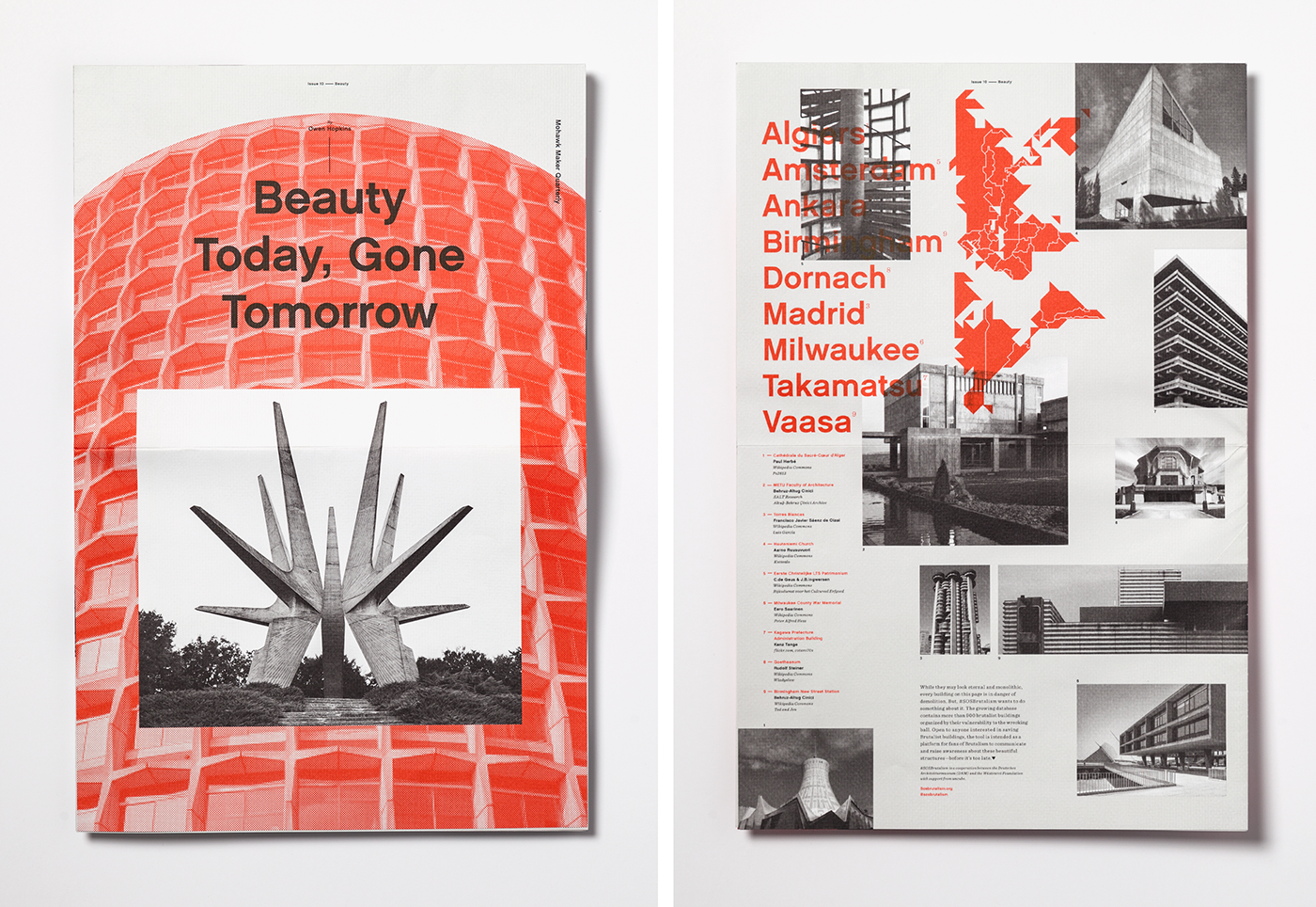
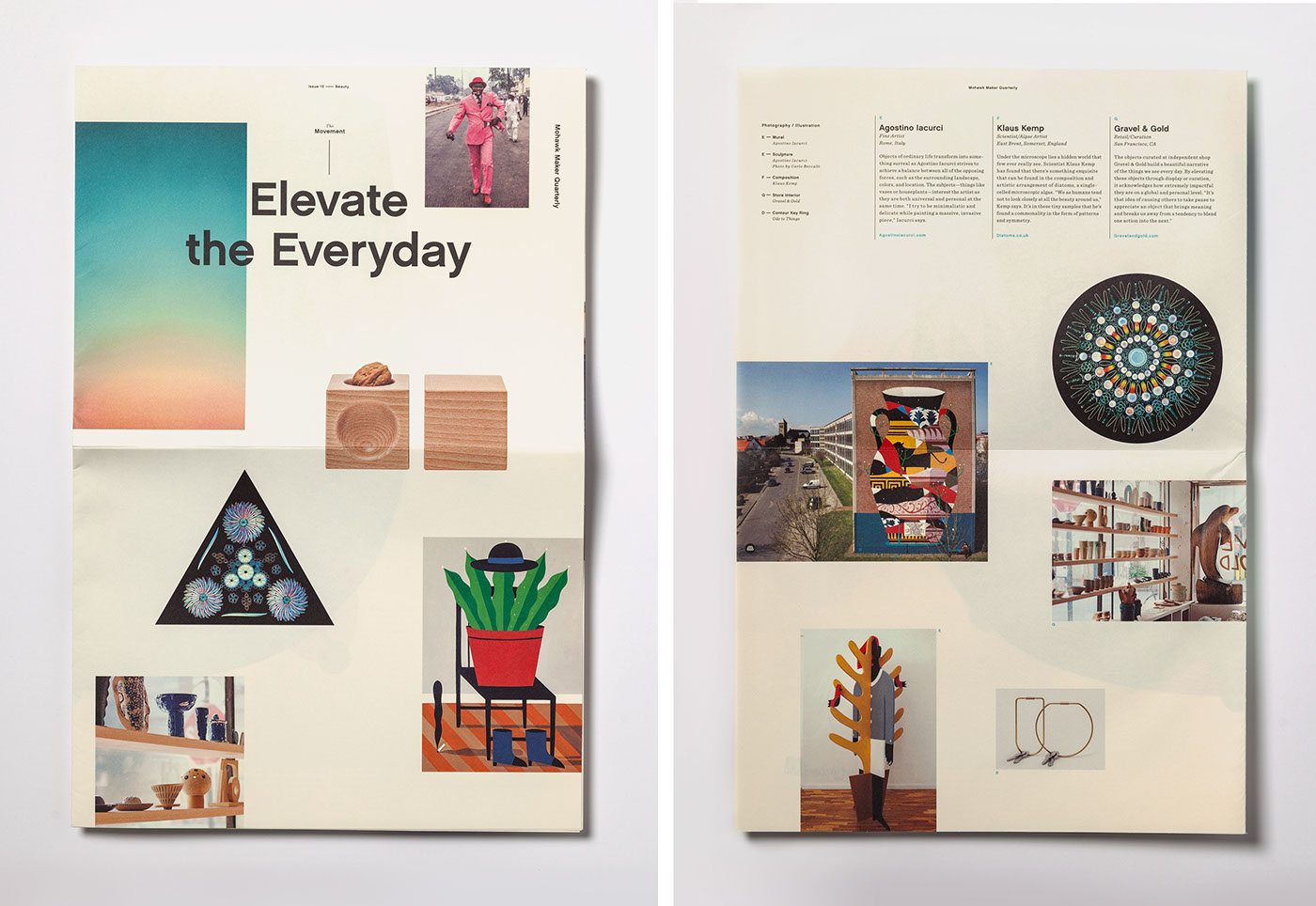
Mohawk Maker Quarterly #10: Beauty

Beauty isn’t a superficial aesthetic trait; it inspires, moves and engages us. It triggers emotion. It attracts. It gives pleasure.

Production Notes
Offset Printing
A commonly used printing technique in which the inked image is transferred from a plate to a rubber blanket, then to the printing surface. When used in combination with the lithographic process, which is based on the repulsion of oil and water, the offset technique employs a flat (planographic) image carrier on which the image to be printed obtains ink from ink rollers, while the non-printing area attracts a water-based film (called "fountain solution"), keeping the non-printing areas ink-free.
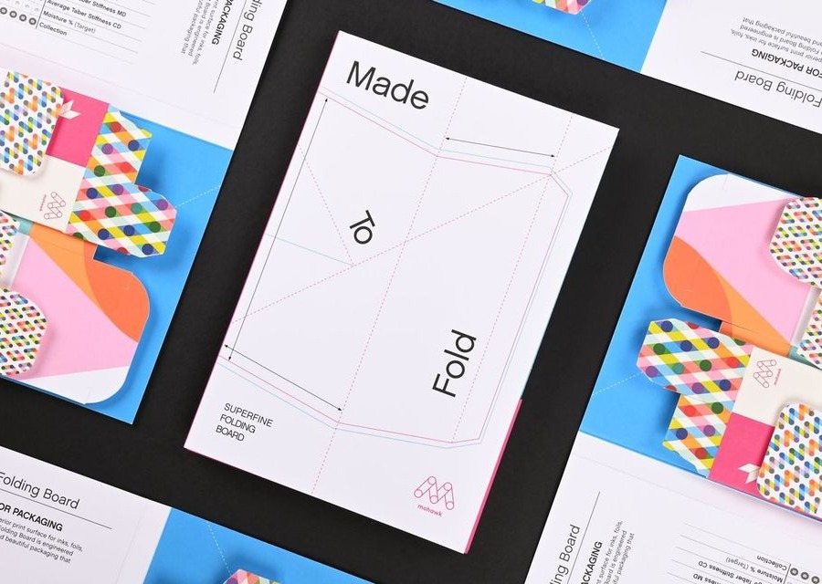
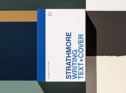
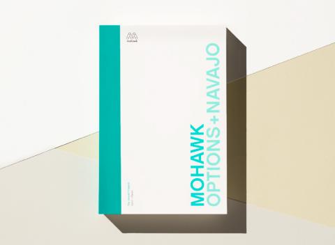
Materials Used
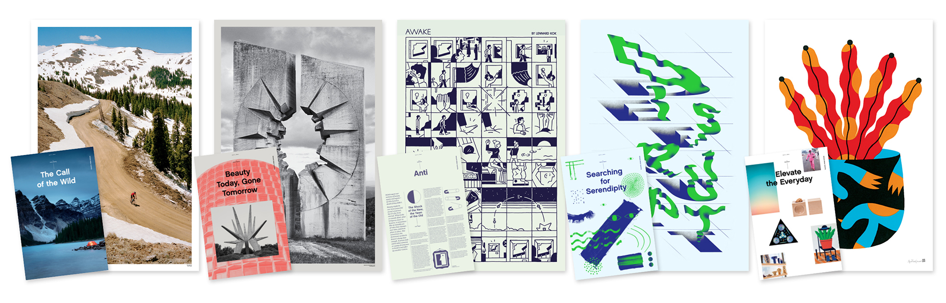
Suggested Articles
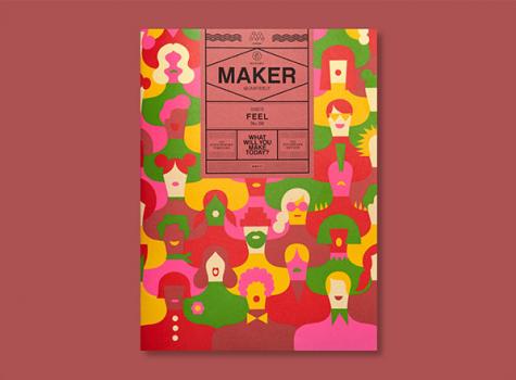
Issue eight of the Mohawk Maker Quarterly tackles the topic of “feel,” exploring how experiences, environments, and objects invoke this nuanced word.
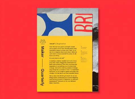
After two years of publication, the ninth issue of the Mohawk Maker Quarterly has been refreshed and redesigned, serendipitously themed around the concept of inspiration.
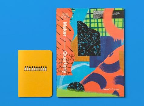
The process of making something — method, materials, ingredients, artistry, experience — is the squiggly line between idea and object. In issue 11 of the Mohawk Maker Quarterly, we celebrate makers who take conscious paths to get from Point A to Point B.