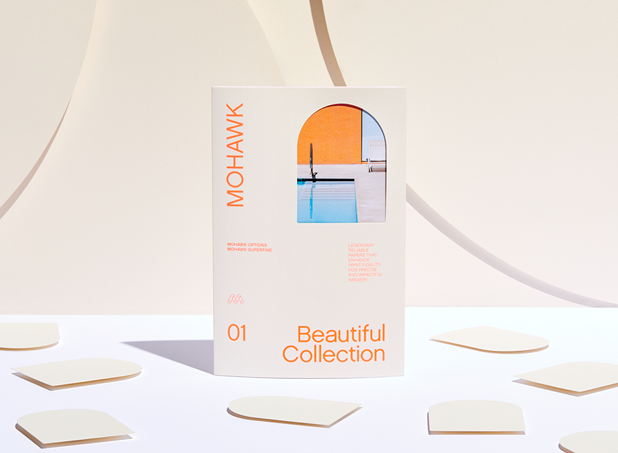
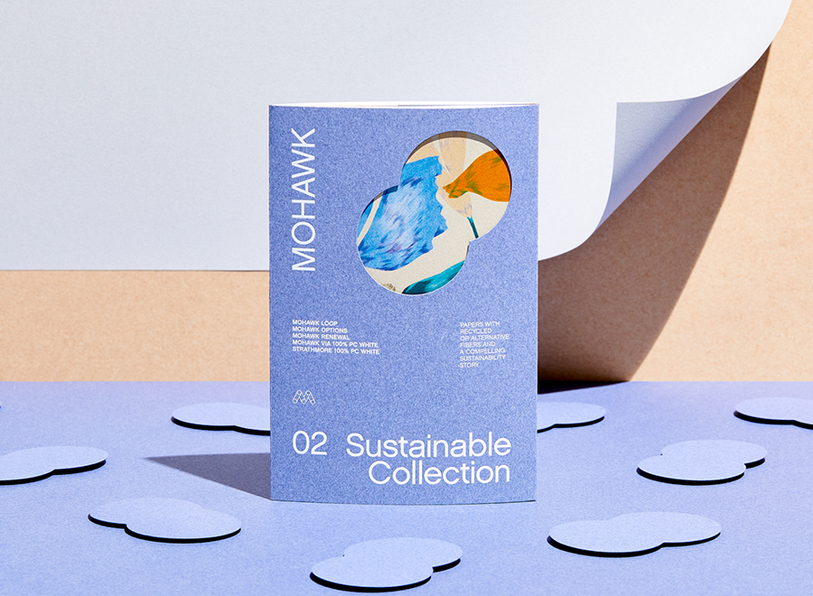
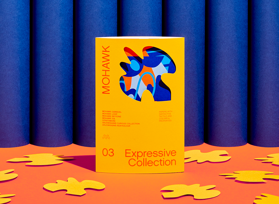
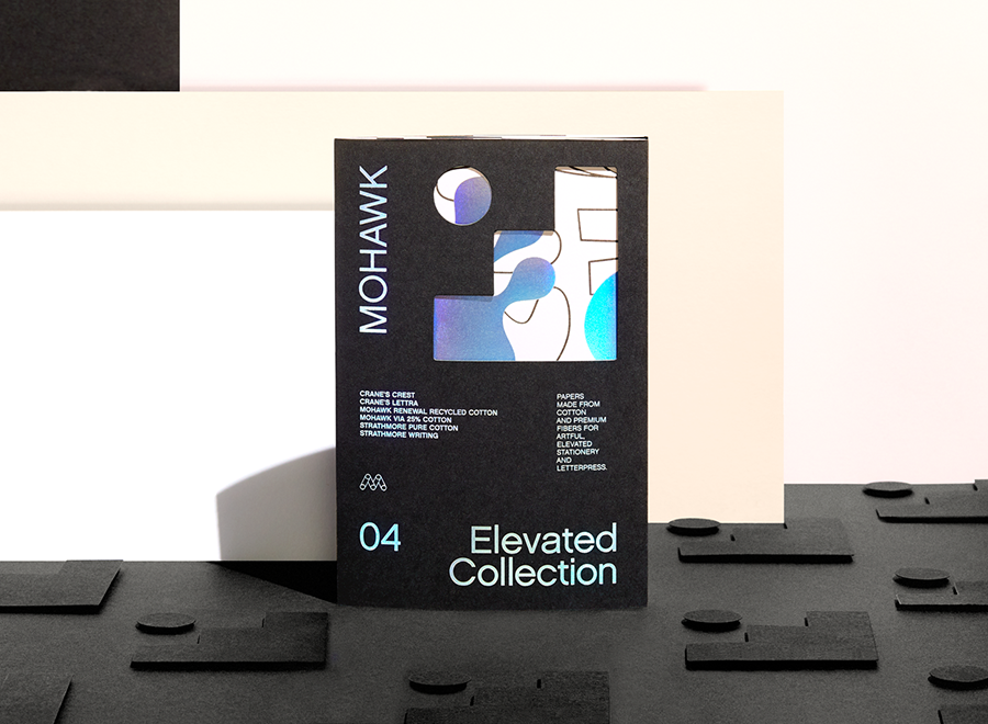
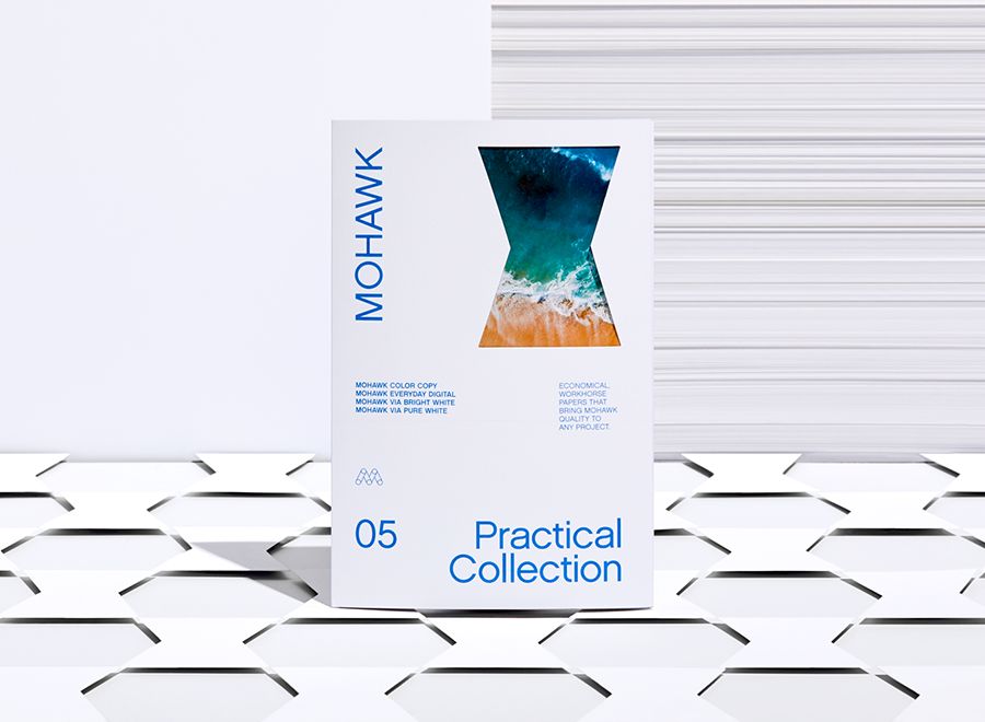
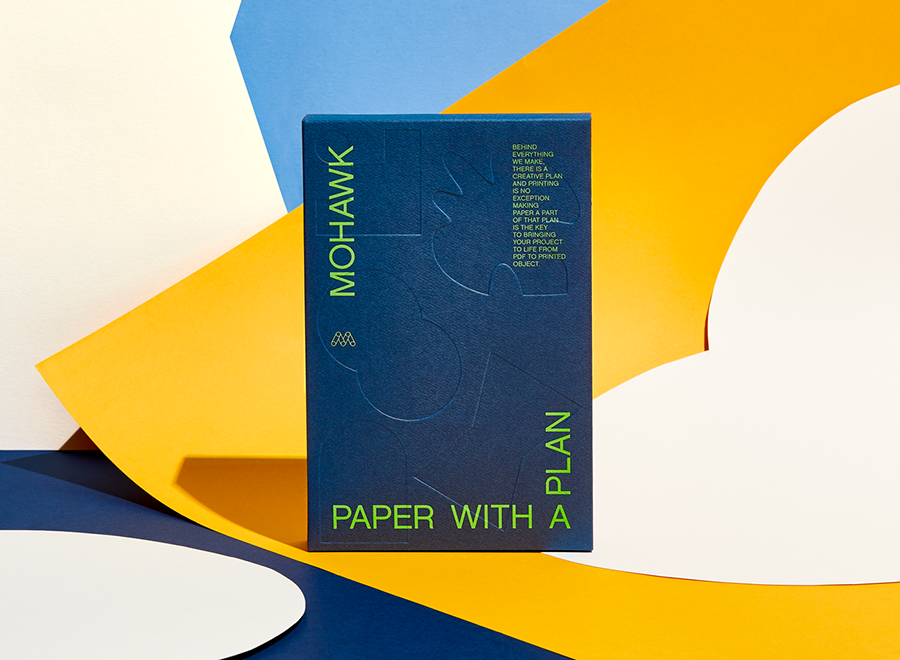
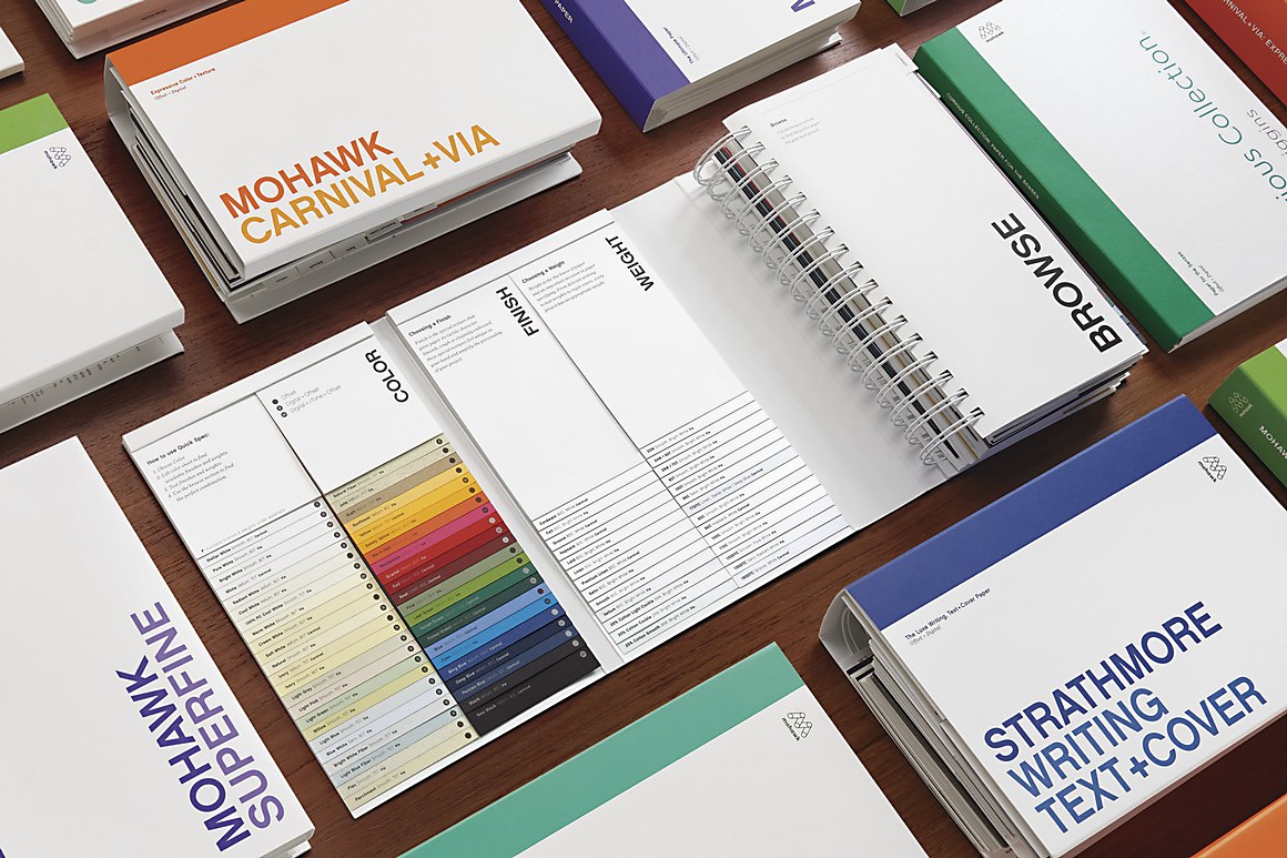
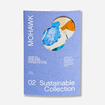
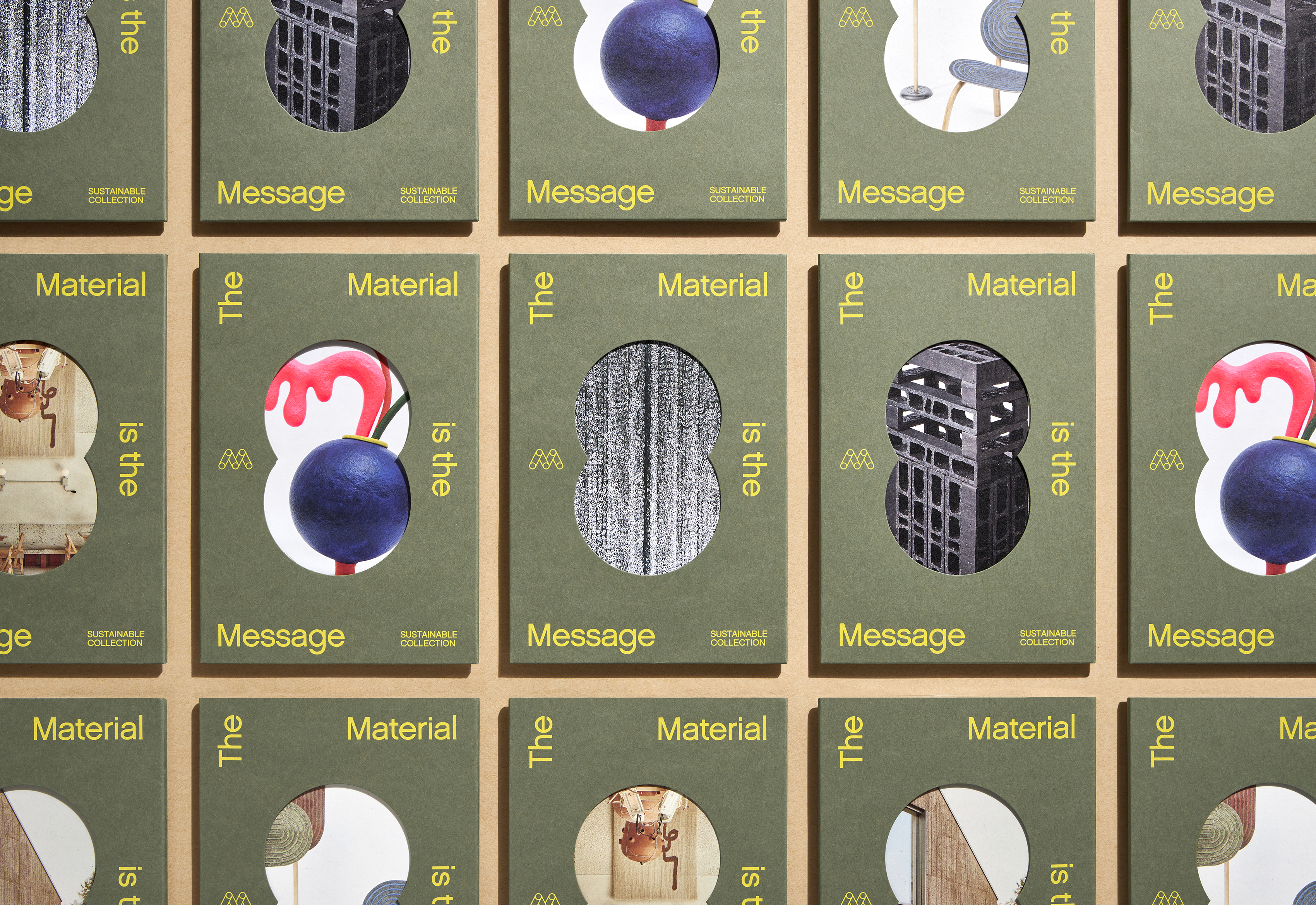
Mohawk Renewal marks a bold new chapter in our ongoing commitment to sustainability and innovation in papermaking.
Recently, we delved into the basics of spot colors. If you’re curious how they differ from process colors or when they should be used – we recommend you pause here and check out our introductory article.
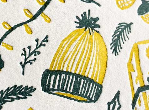
We can’t think of any better way to wrap up another year but to give all of our customers, colleagues and friends a warm, heartfelt holiday greeting. Our 2016 Mohawk holiday card does just that, by celebrating the artful craftsmanship of design, illustration and printing…and of course paper!
In 1913 Horace Moses, who founded Strathmore in 1892, advocated the establishment of a company publication which would help employees stay in touch with each other and the company leadership. Out of this was born The Strathmorean, designed and printed monthly through most of the 20th century.
“It feels luxe.” That’s how Bruce Watermann, Blurb’s SVP of Operations, describes the tactile nature of Mohawk Superfine.
Today, guest blogger, Sarah Schwartz, editor of Stationery Trends and The Paper Chronicles, brings us the story of Greetabl.
Does pink signify modern and bold? Or does it seem soft and feminine? Perception of color—including context, culture and personal preferences—shapes our response to the colors we see. Perception of color is why red signifies “stop” when you see it on the street, and “love” when you see it in the greeting card aisle. It’s why color has different meanings across the globe. It’s why the client says she hates purple.
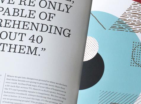
Writer, educator and consultant Debbie Millman is at the forefront of understanding how companies develop smart, effective brands for their products and services. Her book “Brand Thinking” features insightful interviews with prominent practitioners. We invited Debbie to discuss what makes successful brands so good at shaping consumer perception.
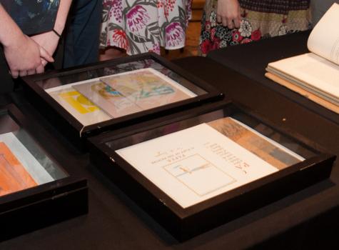
The Strathmore Archive is a treasure trove of over 100 years of rare, historic and beautiful Strathmore paper promotions. Since its discovery, we have been hosting special events and pop-up exhibitions across North America to unveil and share selections from the archive with design enthusiasts and to celebrate Stathmore’s legacy.
