The Making of Maker Quarterly Issue No. 15: The Materials Issue
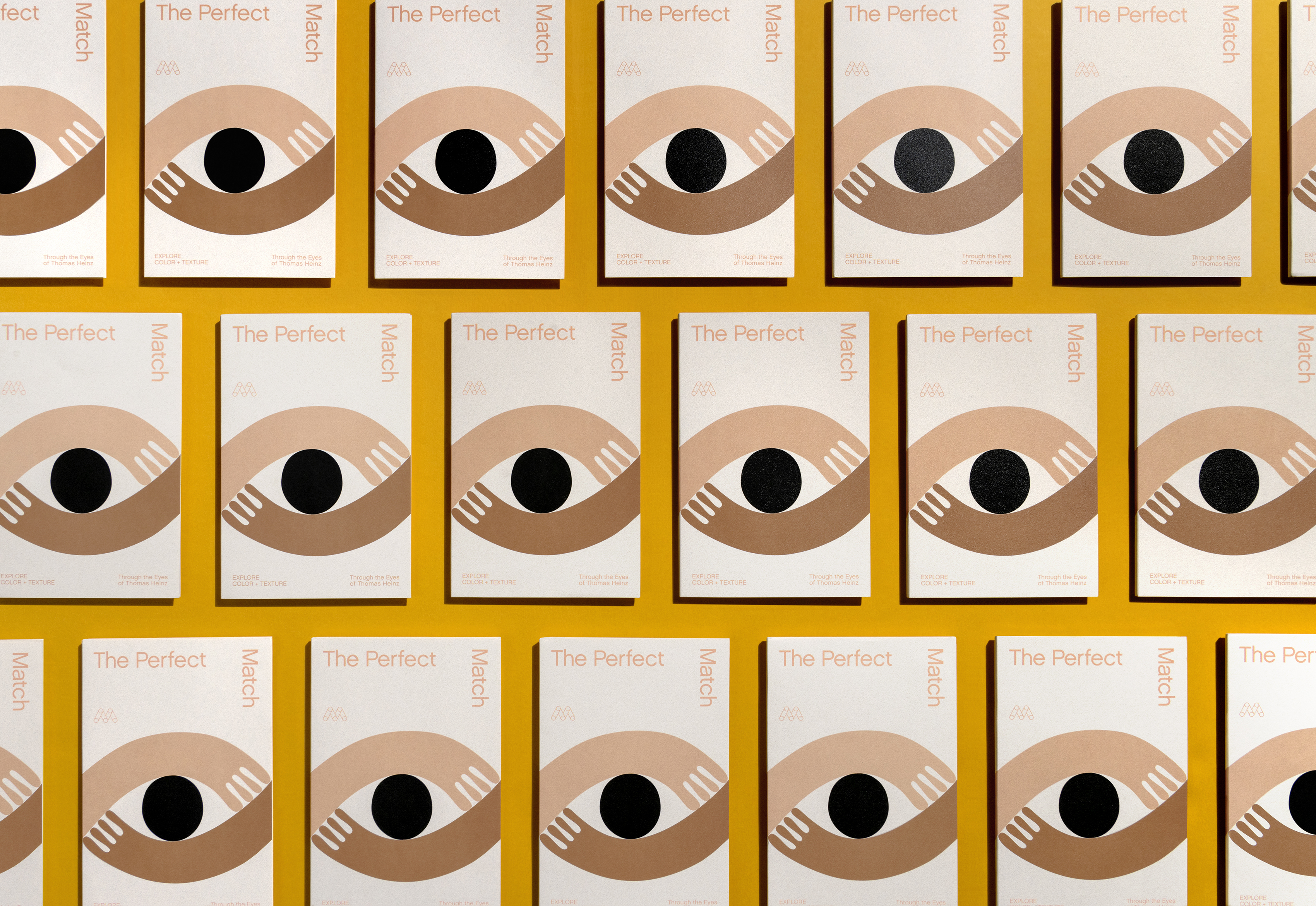
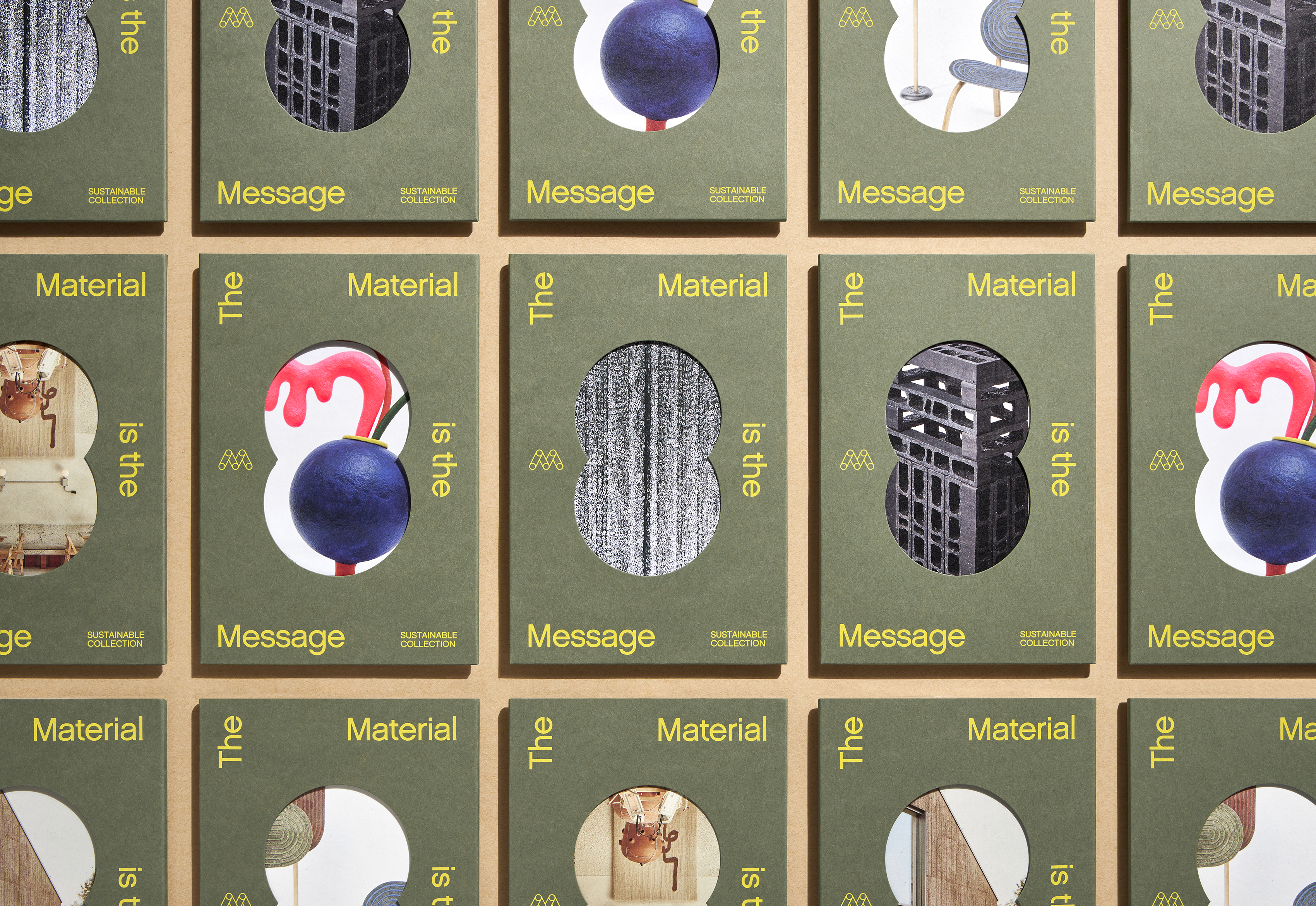
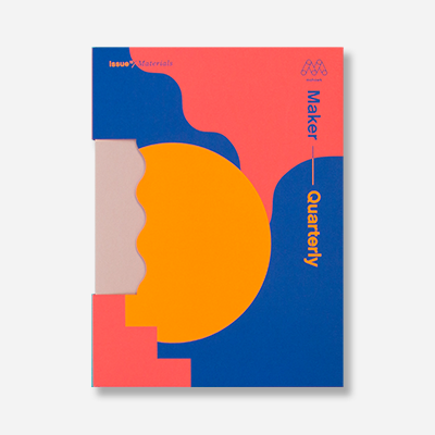
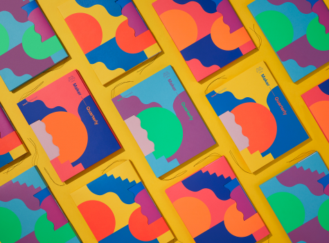
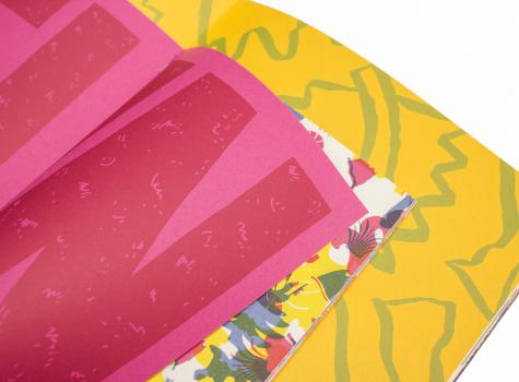
Mohawk Maker Quarterly Issue No. 15 is all about materials.
EXCERPTS FROM THE VIDEO:
Chris Harrold, SVP Marketing + Creative, Mohawk: Every issue of the Maker Quarterly is organized around the topic; in this case, it’s materials — and more specifically, the paper. This is about exposing designers to a new toolset; it’s like a fresh box of colored pencils.
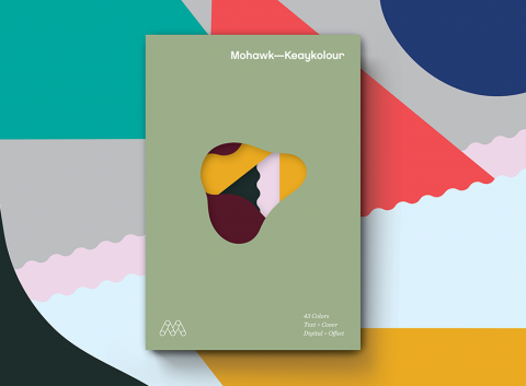
Colored paper is an untapped tool in the toolkit of graphic design.
Larry Westlake, EVP, Sandy Alexander: Well one of the things that the Maker’s Quarterlies have done is, is that it’s the sort of the “What are they going to do next?”
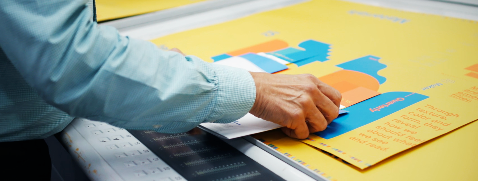
Printing on colored paper does add a completely different twist to most projects. The beauty part of this piece is that not all of the color is designed to conceal the paper, it’s actually to use the paper as a component of color.
Paper becomes part of the design more than it ever did before.
Production Notes
Metallic Inks
Metallic powders in a varnish base create images with metallic luster. Leafing inks which have metal flakes that rise to the top of the ink mixture have more shine, but increased rub off. The metal flakes in non-leafing metallic inks sink down with less rub off and a little less shine. Non-leafing inks with a dull varnish or aqueous coating perform most reliably on uncoated paper.
White Ink
Opaque white ink can create a unique print effect — it is a non-transparent ink which does not let any of the base color show though. The more hits of white used, the more it stands out from the background. White ink can be used alone, or as the base to print color on top, which allows full color imagery to be printed on dark colored paper.
Materials Used
Suggested Articles
Materials are an emotional filter. Through texture, color and form, they reveal how we should feel about what we see and read.
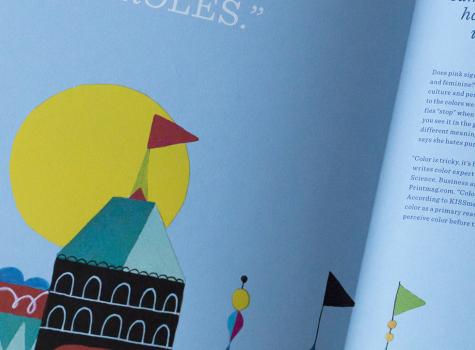
Does pink signify modern and bold? Or does it seem soft and feminine? Perception of color—including context, culture and personal preferences—shapes our response to the colors we see. Perception of color is why red signifies “stop” when you see it on the street, and “love” when you see it in the greeting card aisle. It’s why color has different meanings across the globe. It’s why the client says she hates purple.
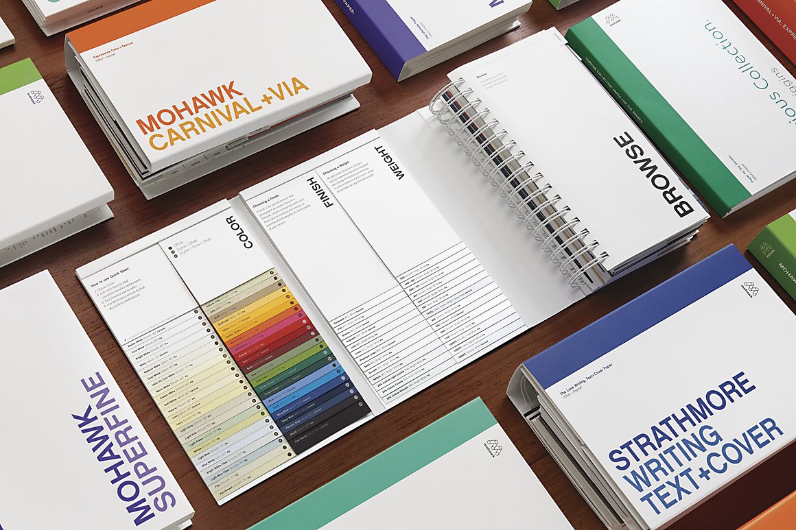
Colored paper opens up new possibilities for design and communication. Used with 4-color printing, it can become part of the image itself, giving you an additional color to work with. Have you ever thought about using colored paper as a bonus in your project?
