


We ♥ Milton Glaser | 1929-2020
“Every once in a while, you really get an opportunity to make things better than they were before.” —Milton Glaser
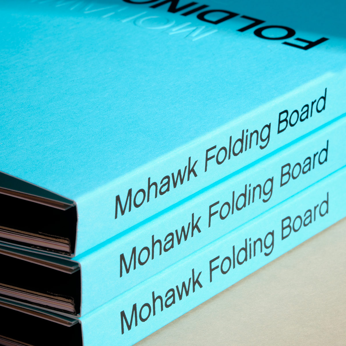
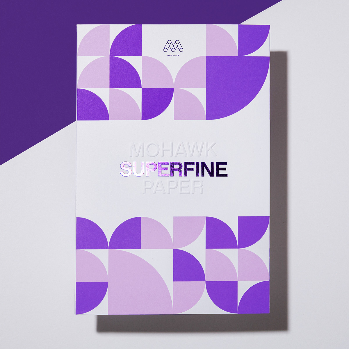
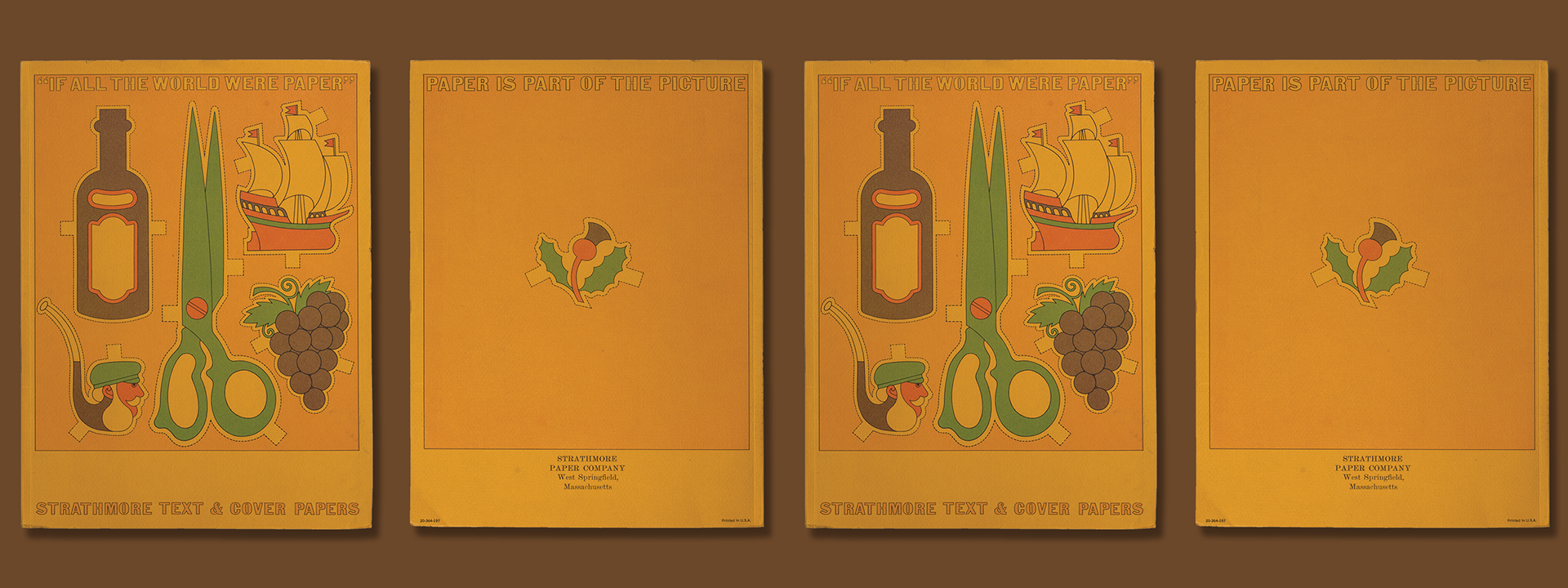
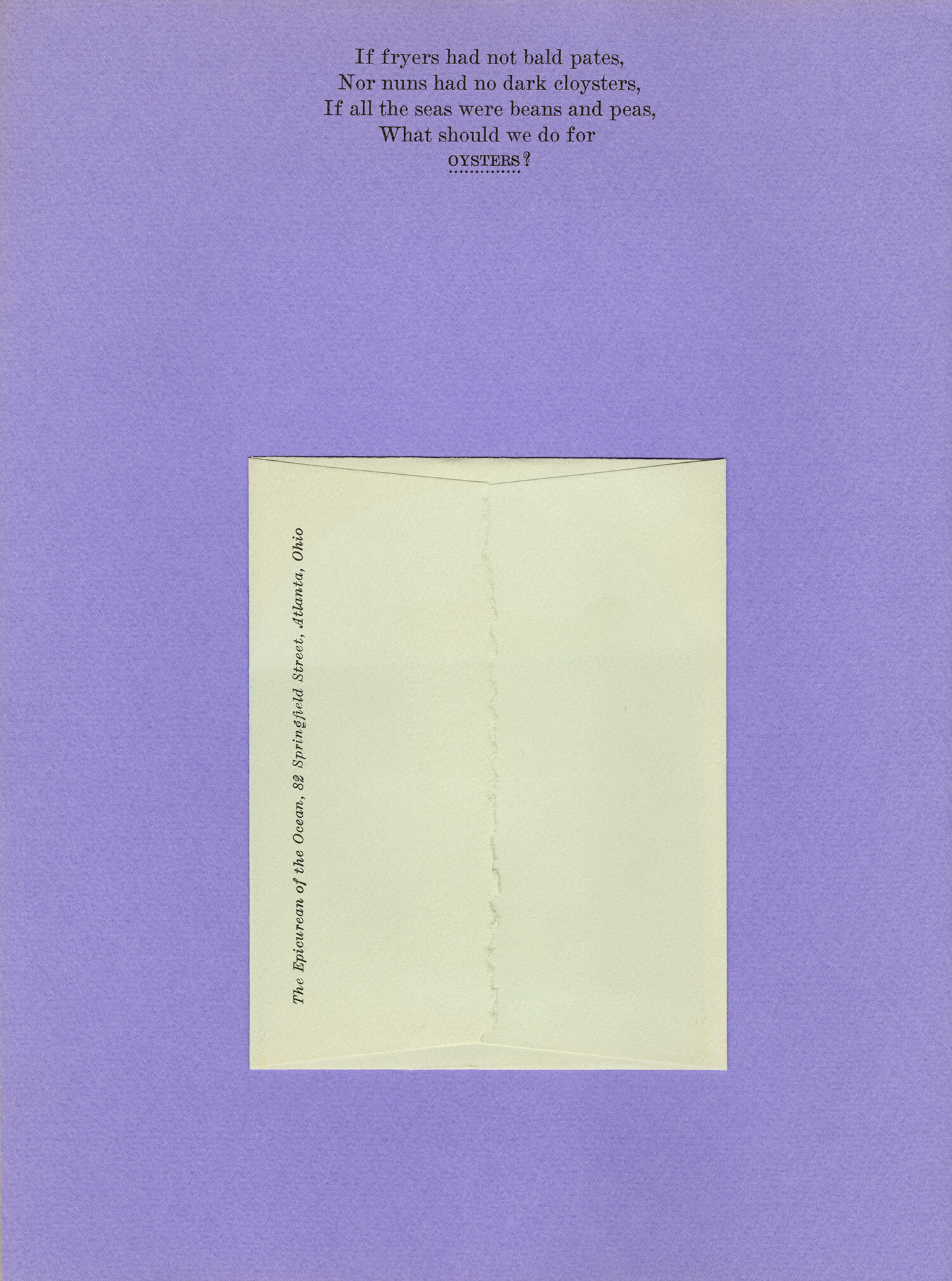
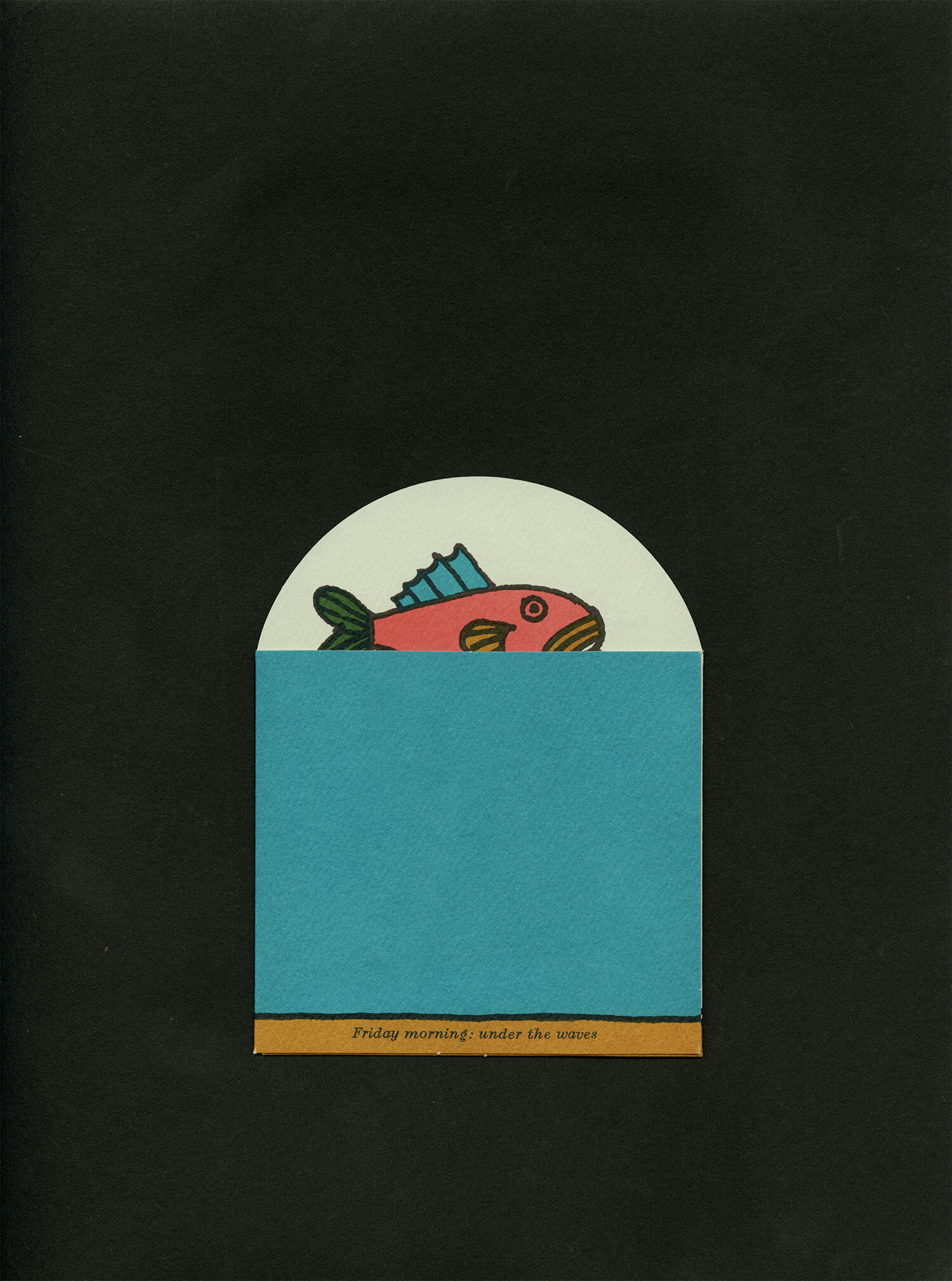
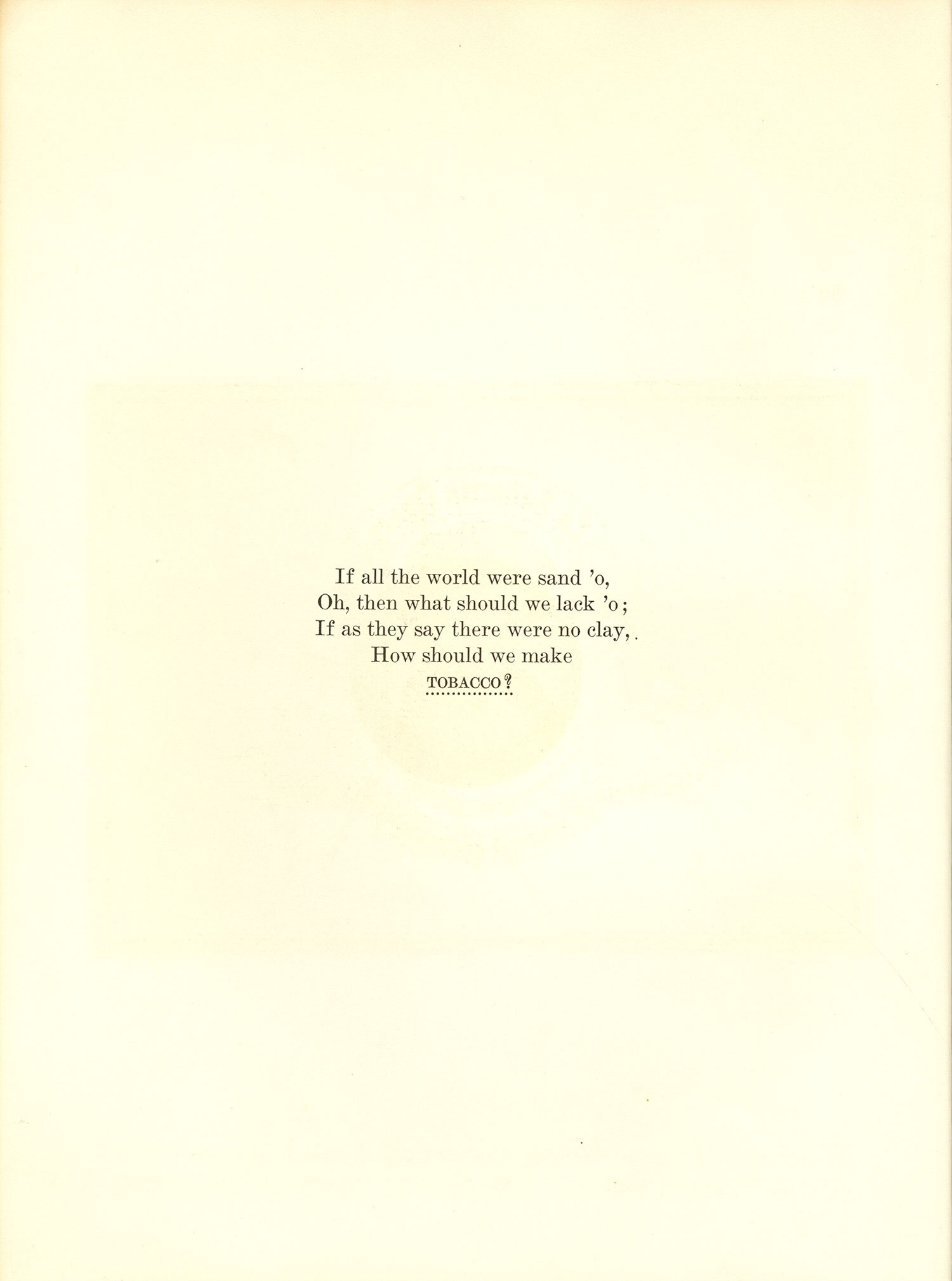
The concept came from a nursery rhyme that originally appeared as "Interrogative Cantilena" in John Mennes and James Smith’s Facetiae (c. 1658). The designs represented a renewed interest in making paper part of the picture, but this time with die-cuts, gatefolds and other finishing techniques that physically brought paper into a design.
Suggested Articles
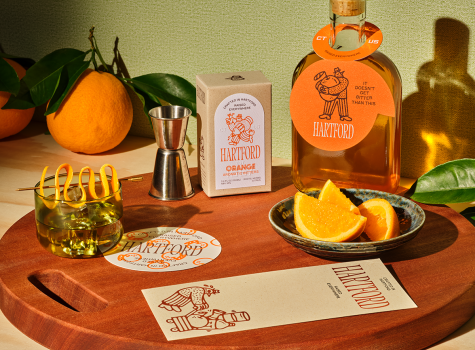
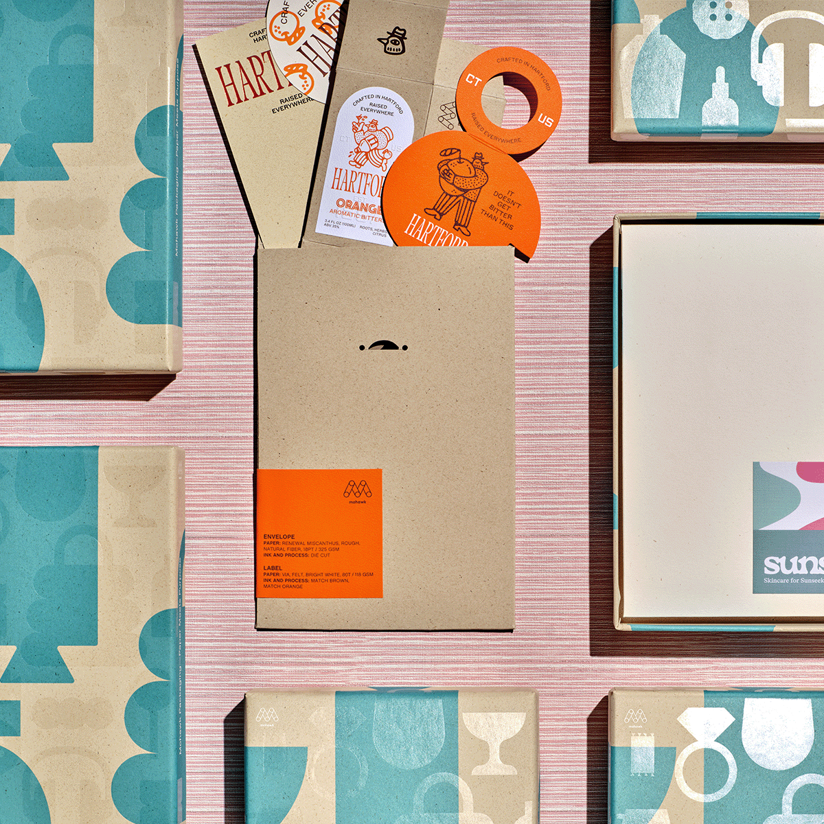
If Sunsalt is a sunlit afternoon, Hartford is the quiet hour that follows — unhurried, intentional, and crafted with care.
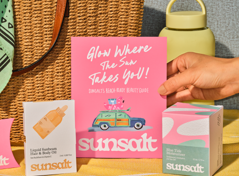
Sunsalt's identity is built on warmth, ease, and the quiet pleasure of a long summer day — the kind you feel on your skin long after the sun has set.
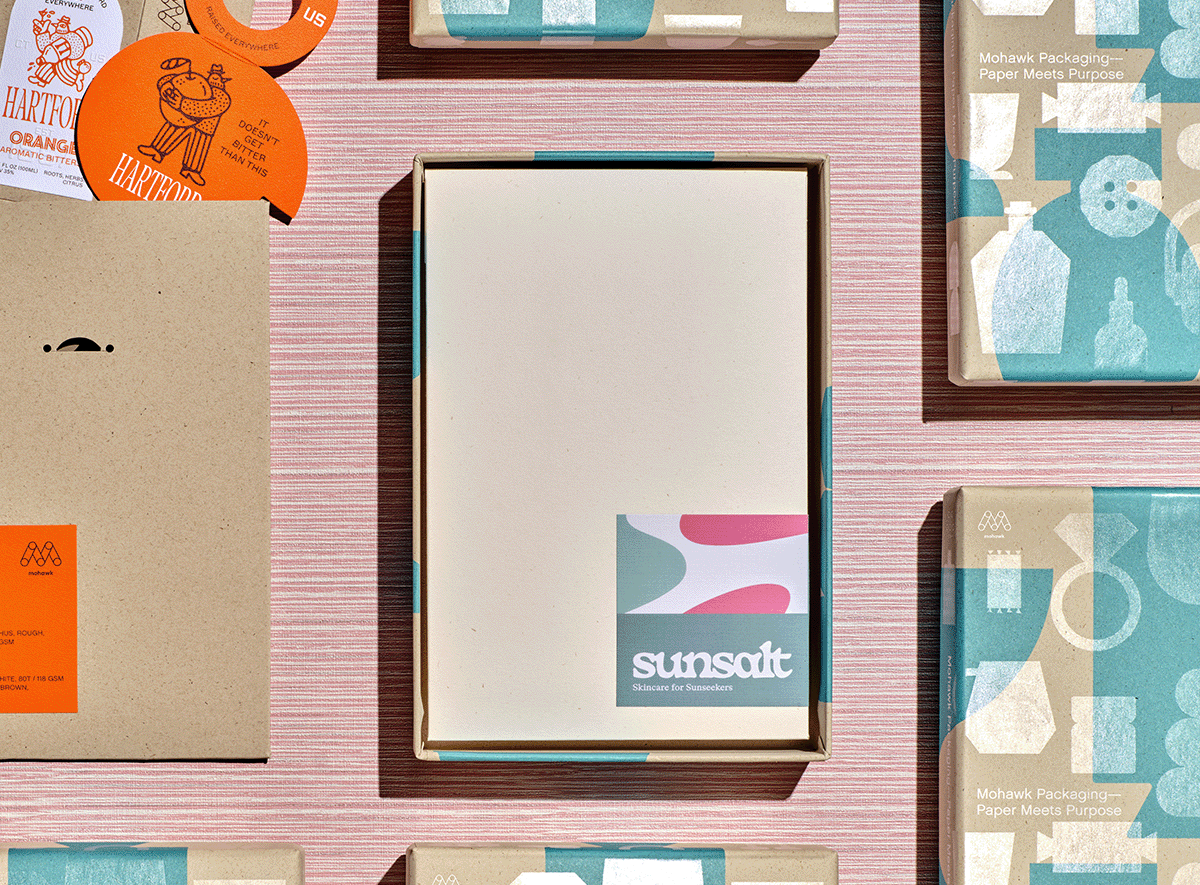
In a world saturated with digital impressions, the brands that endure are the ones you can feel.