


Mohawk Blog
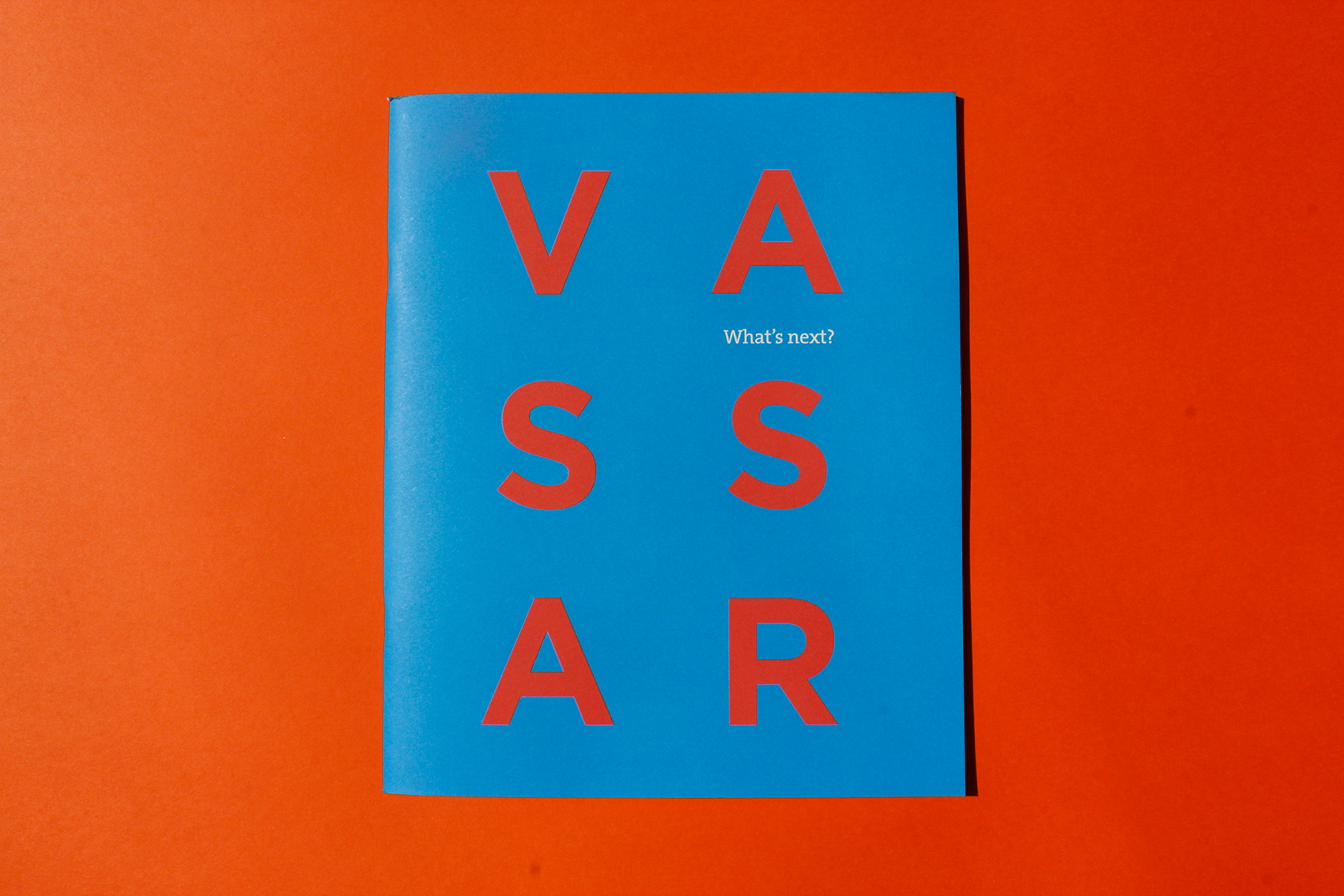
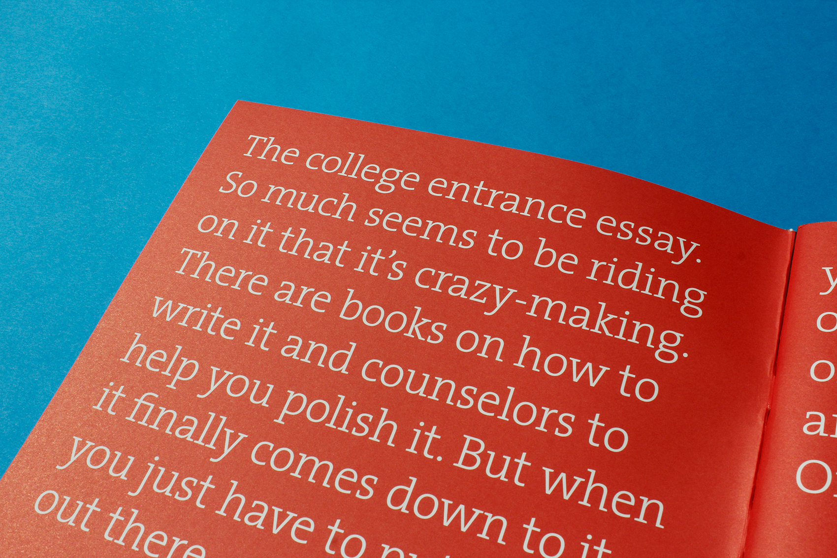
From Prospect to Accepted — The Art of the College Viewbook
Words
Casey Fisk
Photography
Mohawk
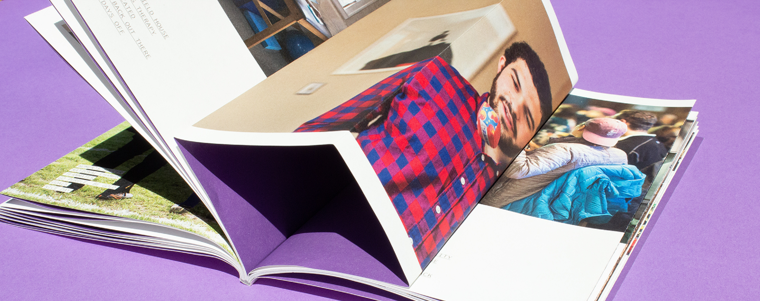
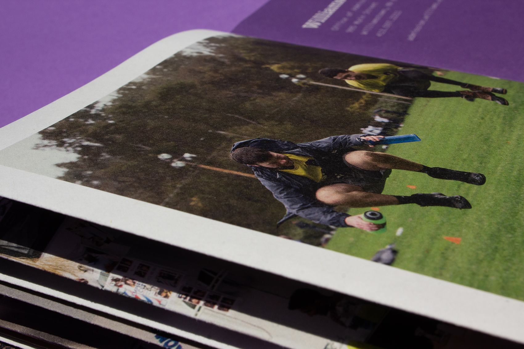
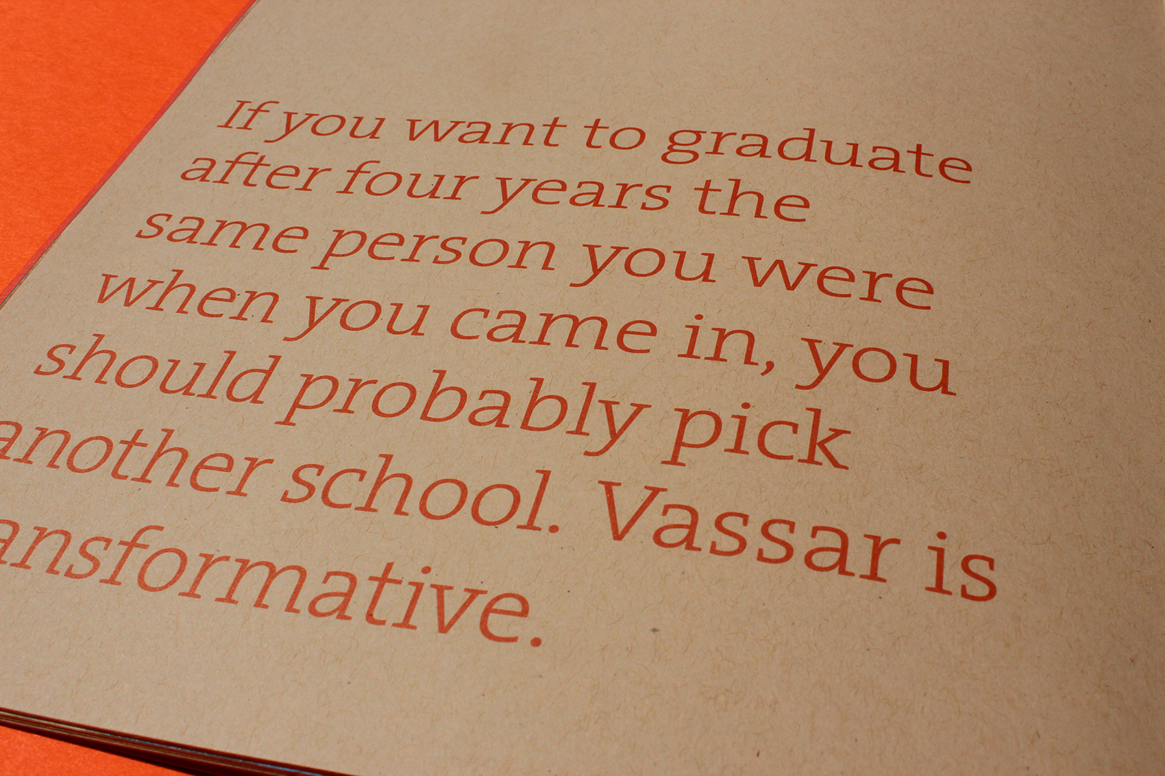
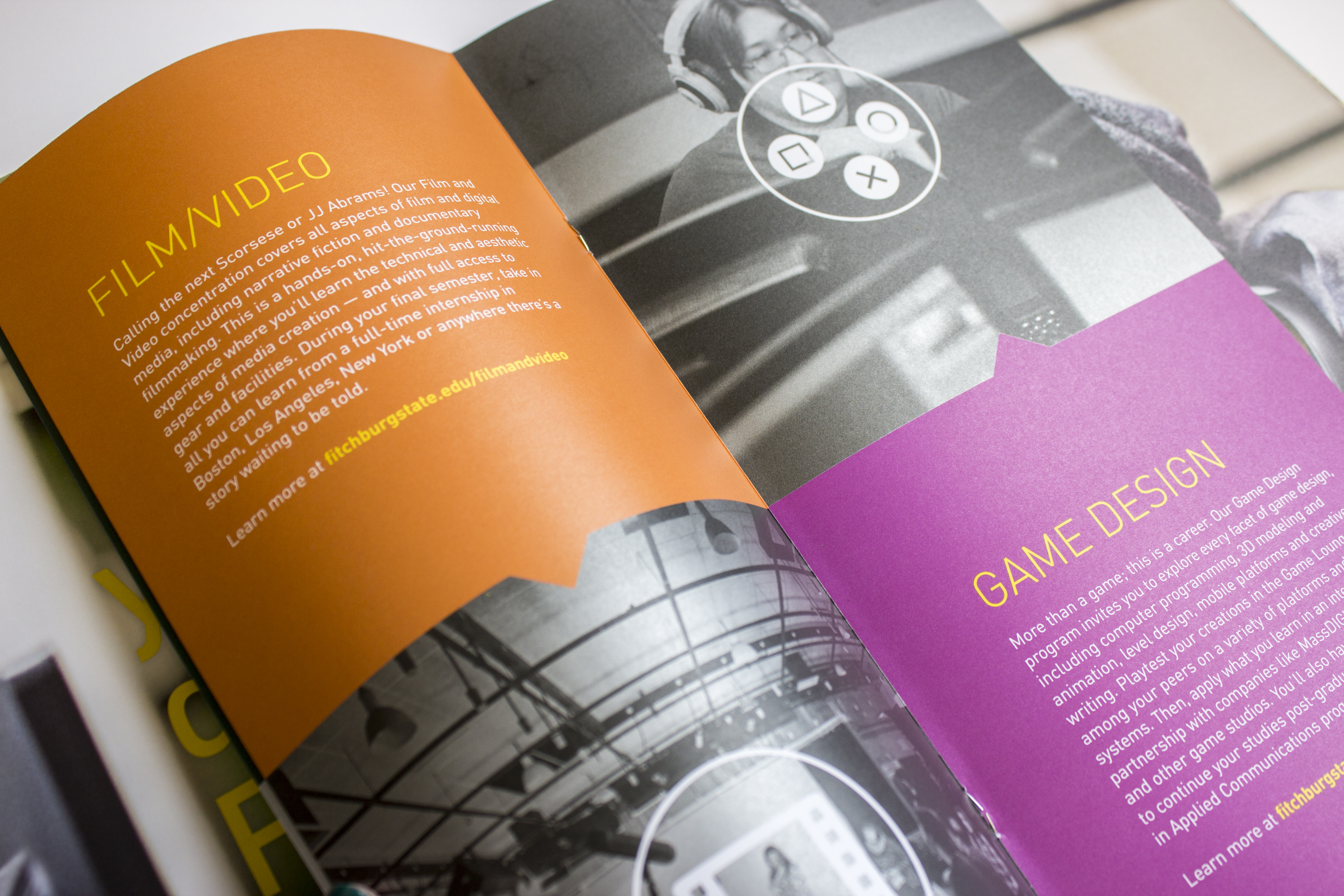
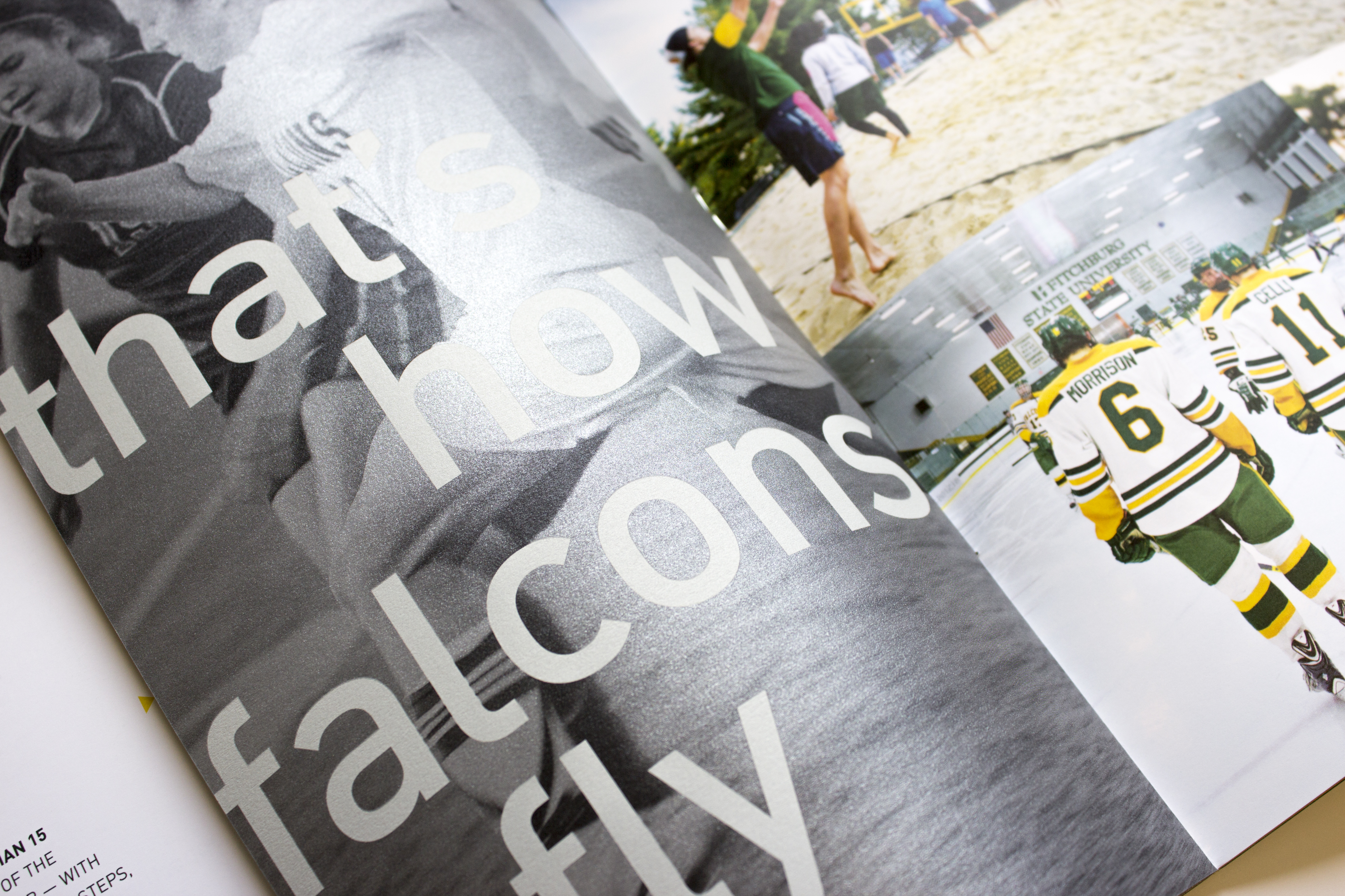
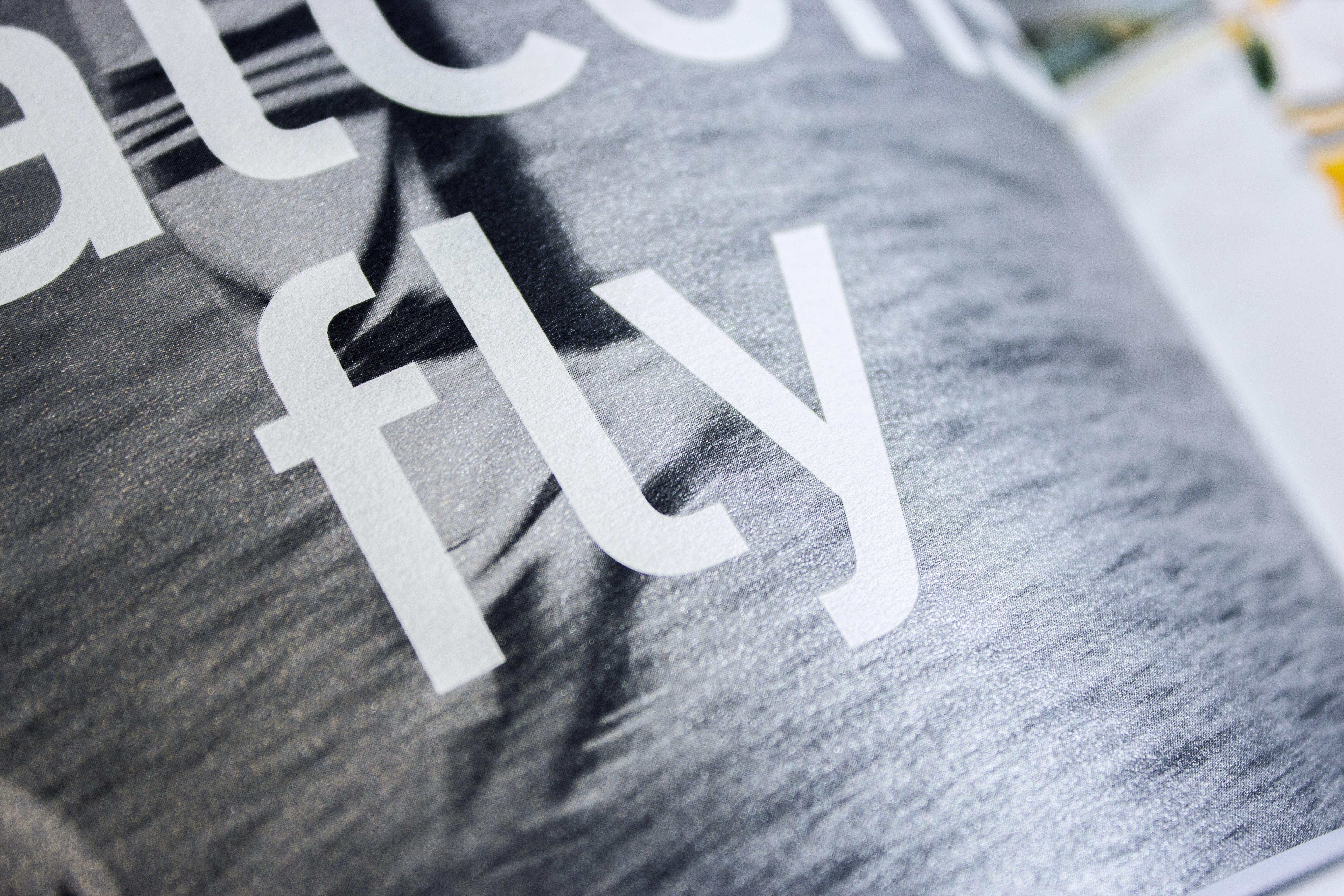
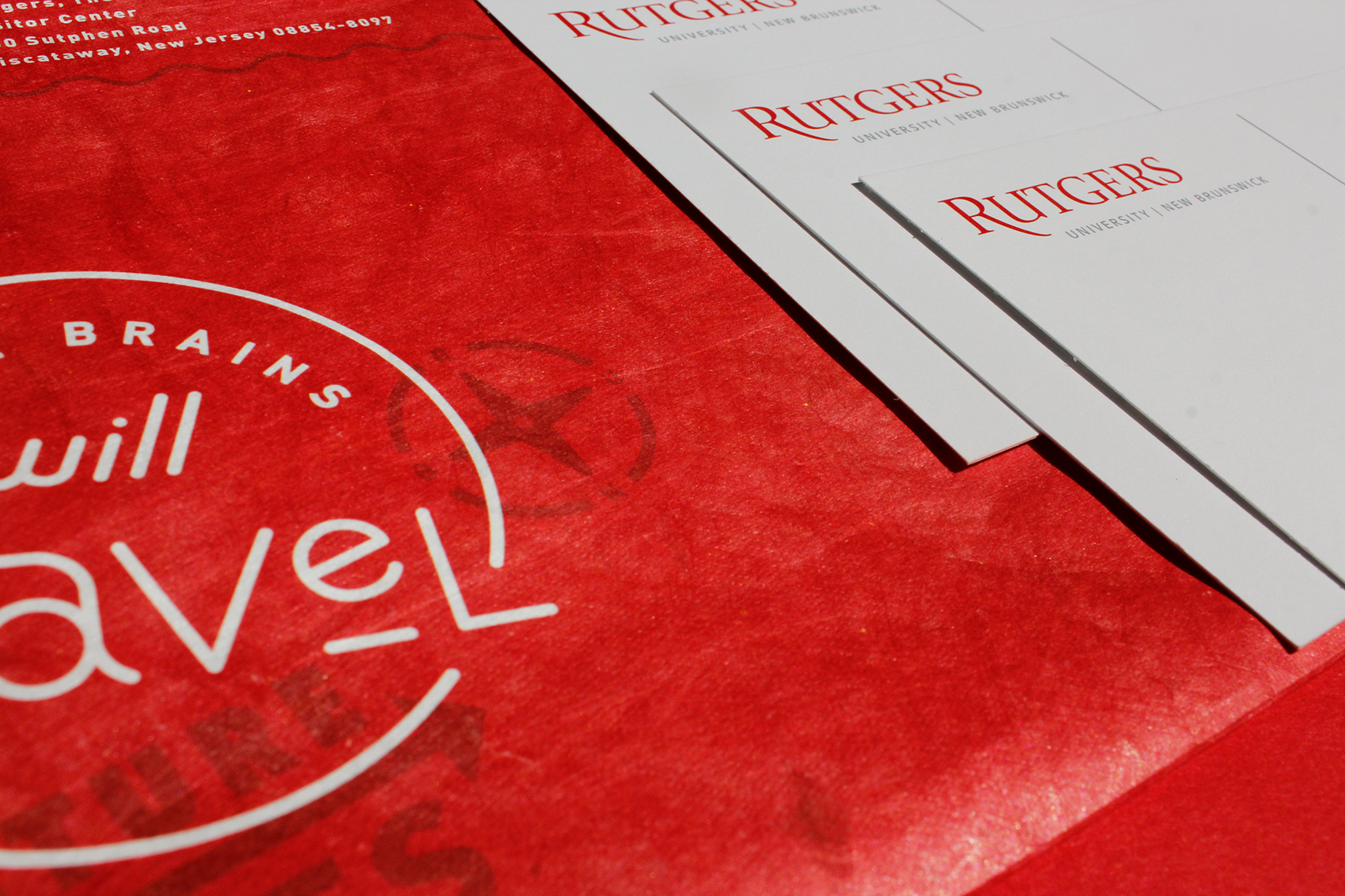
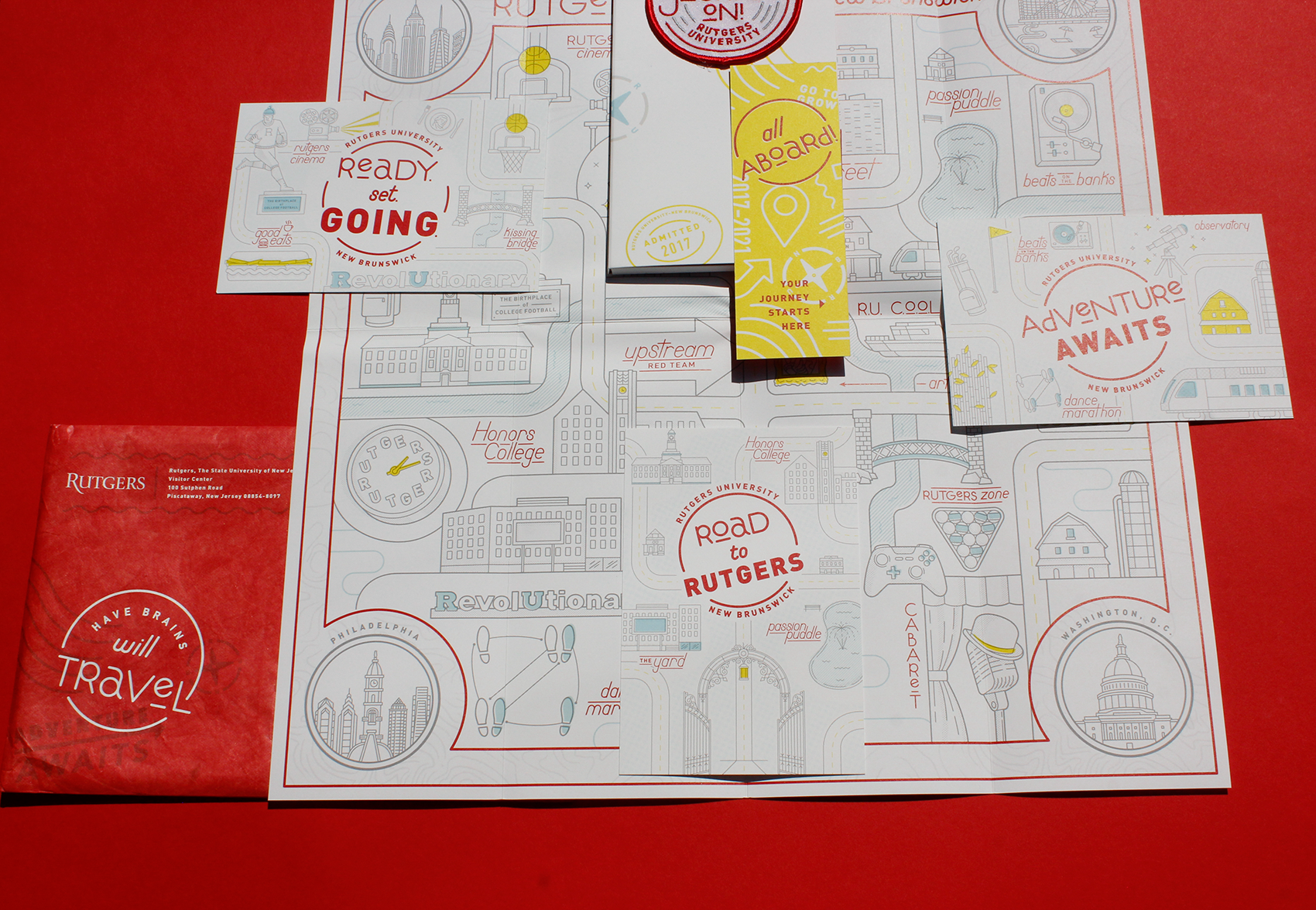
Scholars of tomorrow will make an impact on us — but first, a college or university viewbook must make an impact on them.
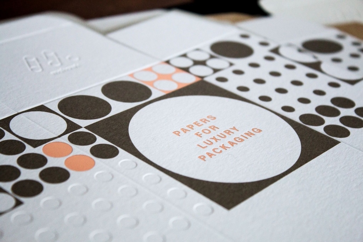
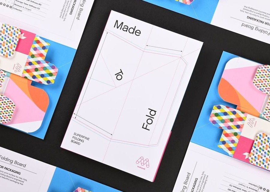
Mohawk Via Smooth
100% PC Cool White 70 Text
Mohawk Superfine Smooth
Ultrawhite 80 Cover
Mohawk Superfine Smooth
Ultrawhite 80 Text
Mohawk Via Vellum
Kraft 70 Text
“Viewbooks have the responsibility of conveying the essence and quality of an institution and require an investment in craft.”
Gardiner Rhoderick
Creative Director, Mighty Citizen
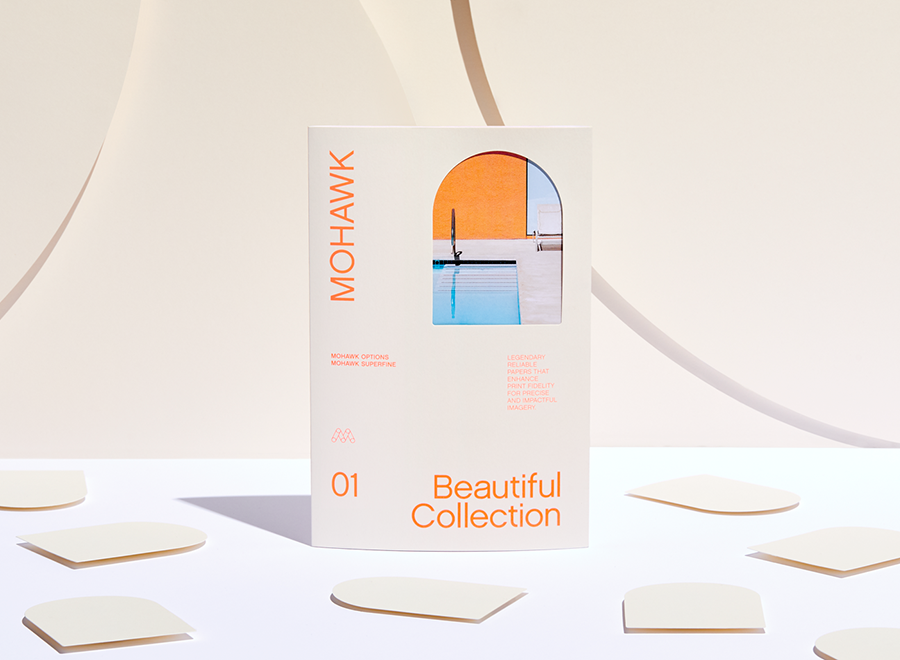
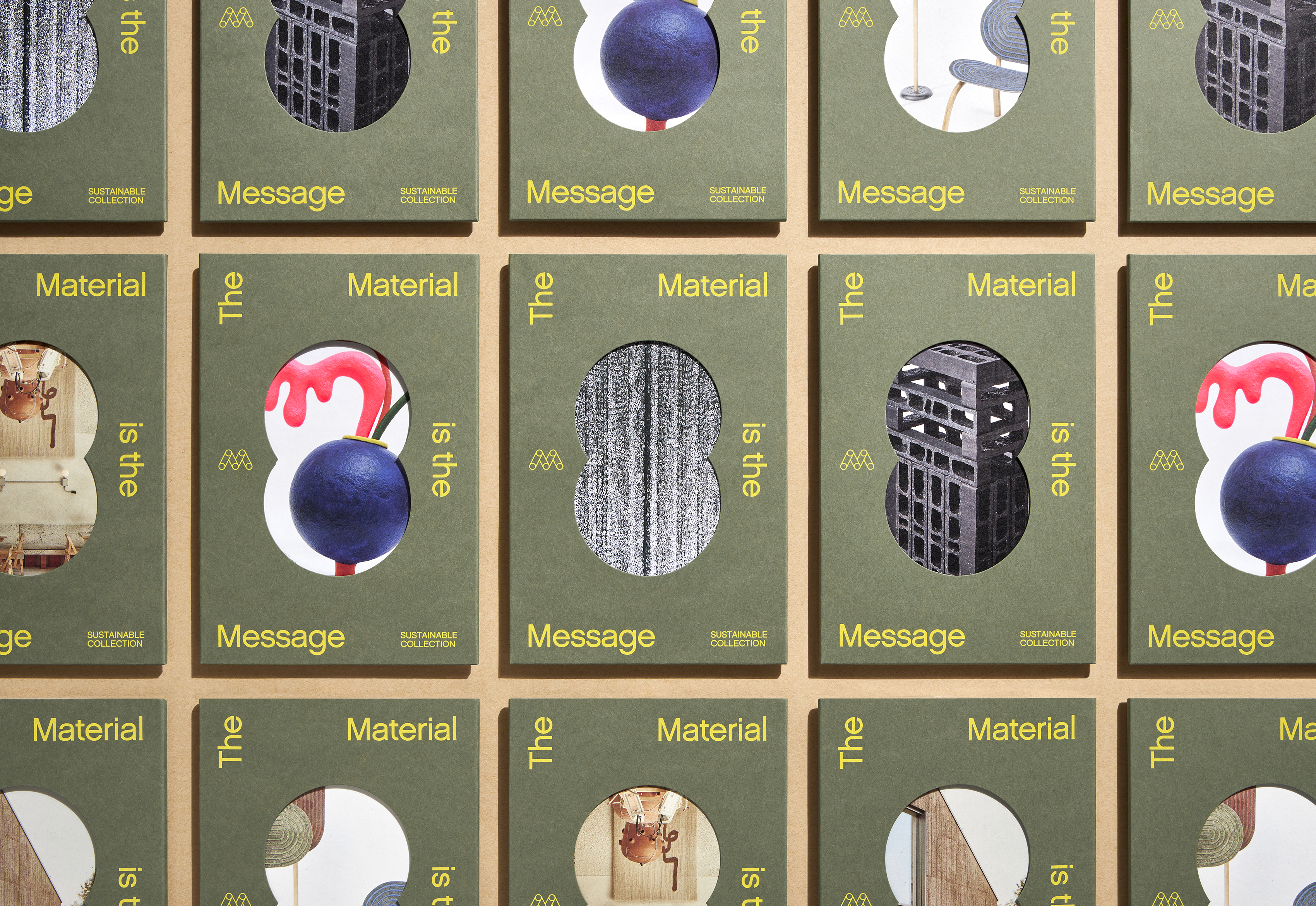
Mohawk Via Smooth 100% PC Cool White 70 Text
French fold, perfect bound

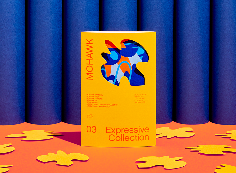
Mohawk Loop Inxwell Vellum
Eco White 80 Text
Mohawk Options Navajo Smooth
Brilliant White 80 Text
Curious Collection Metallics
Galvanised 80 Text
Dense Black
Printed with a double hit of Opaque White
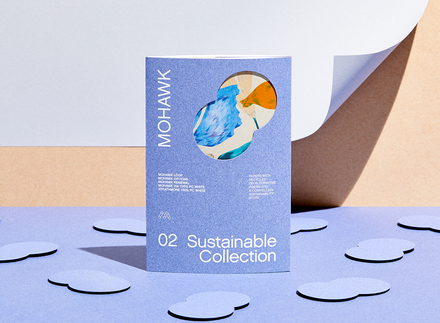
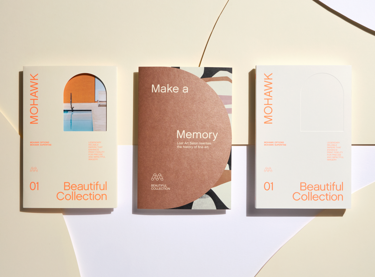
Mohawk Options
100% PC Cool White
Suggested Articles
Field Guides
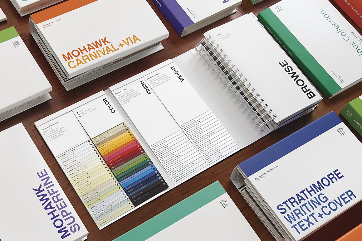
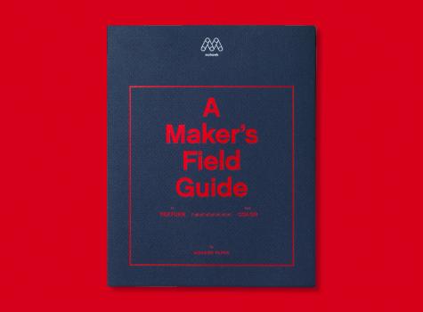
Introducing A Maker’s Field Guide to Texture and Color, an ambitious and comprehensive new printed tool from Mohawk, designed to serve as a hands-on resource for the creative community.
Mohawk Blog
Pairing dramatically different textures can heighten sophistication and elevate your message, capturing your audiences’ attention through touch.
Field Guides
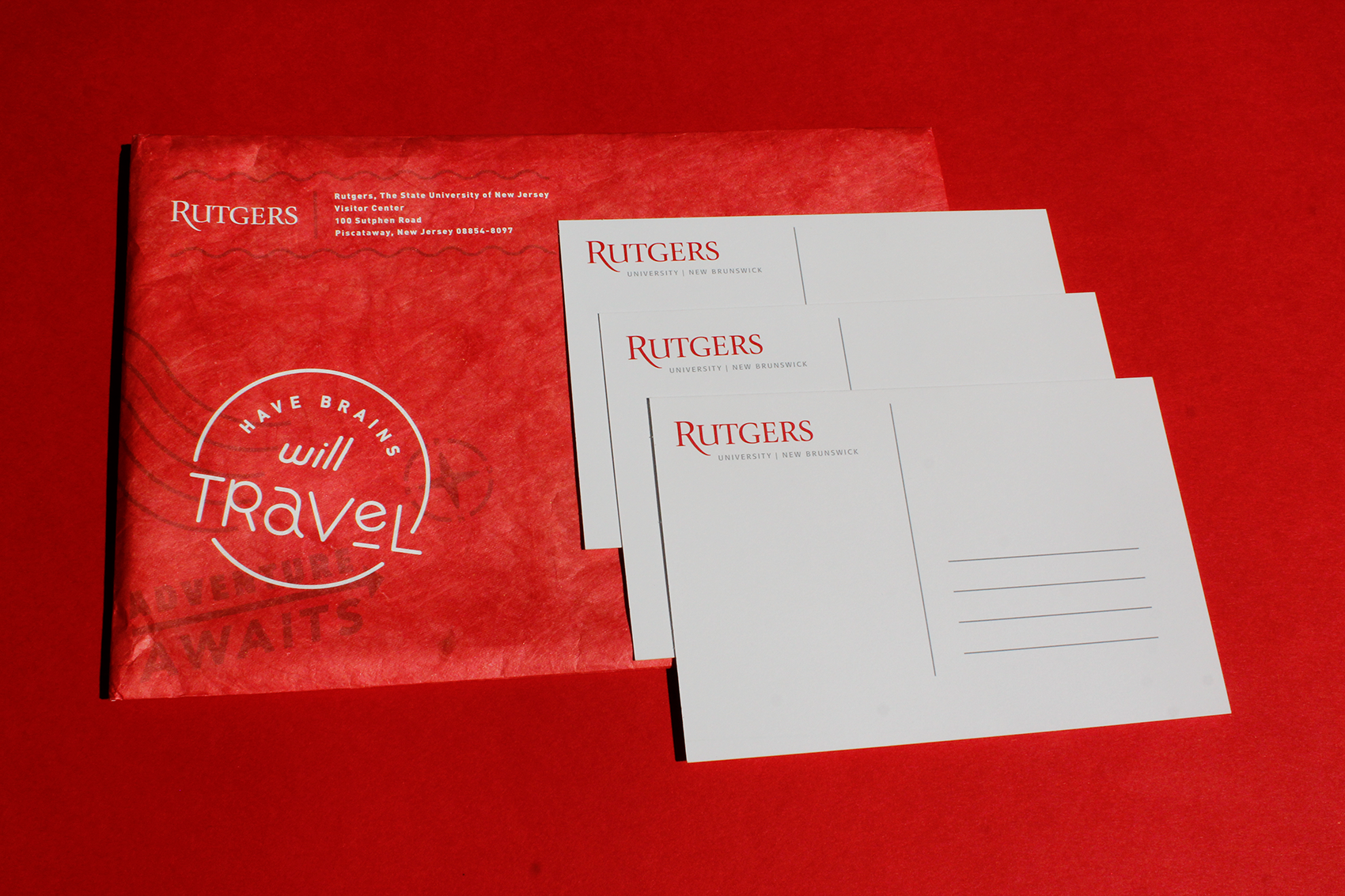
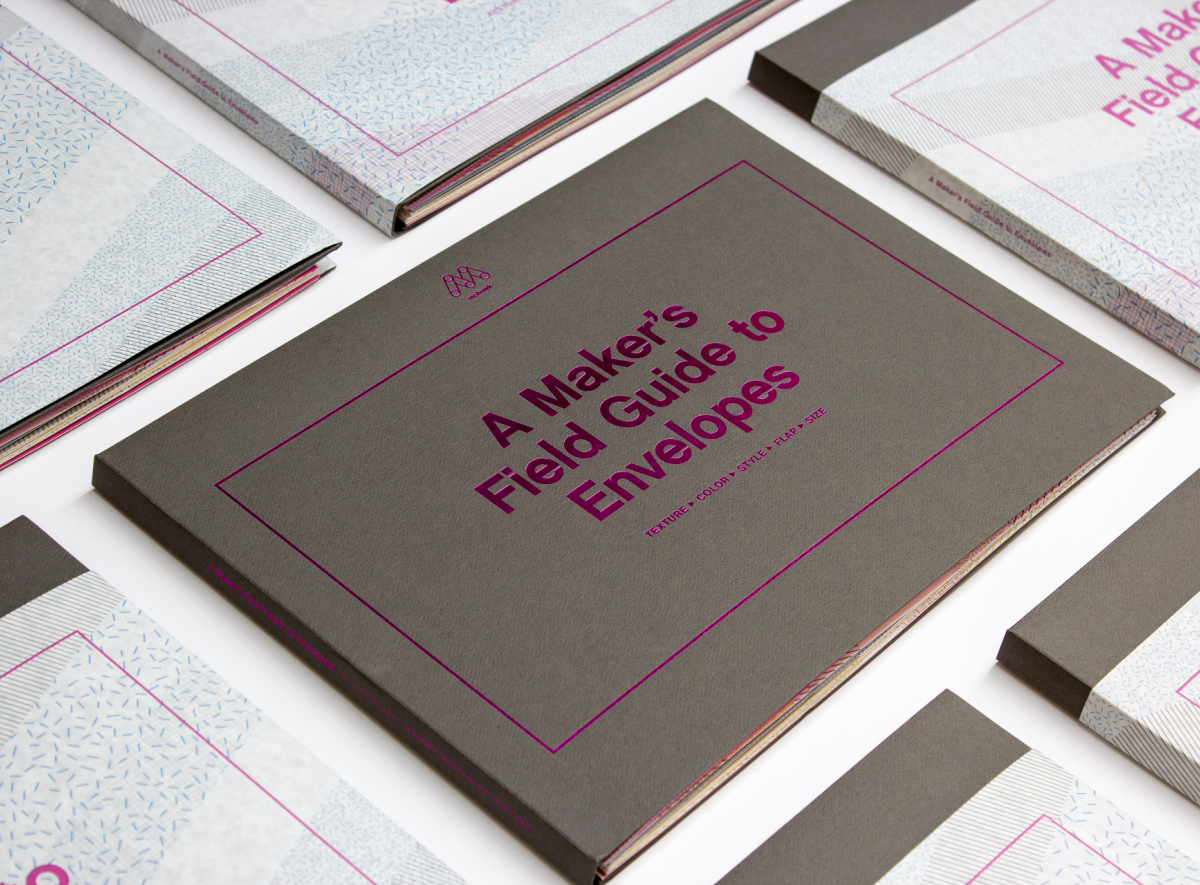
An envelope is a simple and familiar form. It requires no power source or special reader to be held, read and understood. Equal parts function and first impression, an envelope has all the right elements to make any project exceptional.