


Mohawk Blog
Materials Matter: Type Directors Club — Welcome Kit
Words
Casey Fisk
Photography
Firebelly Design
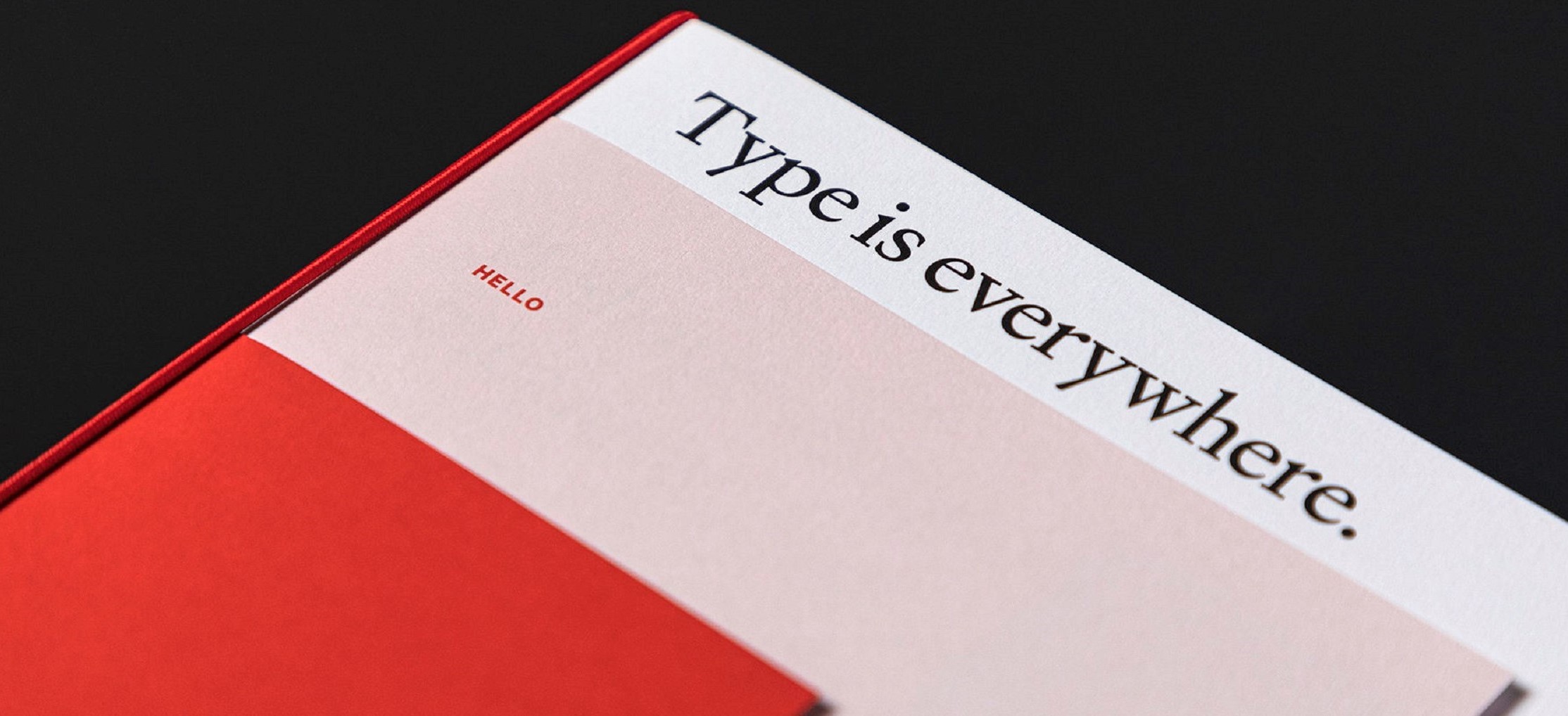
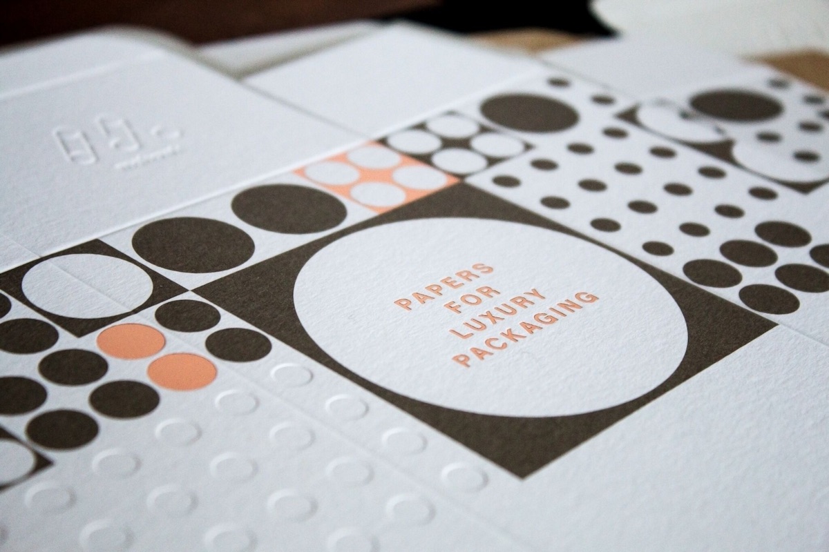
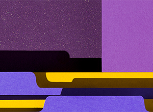
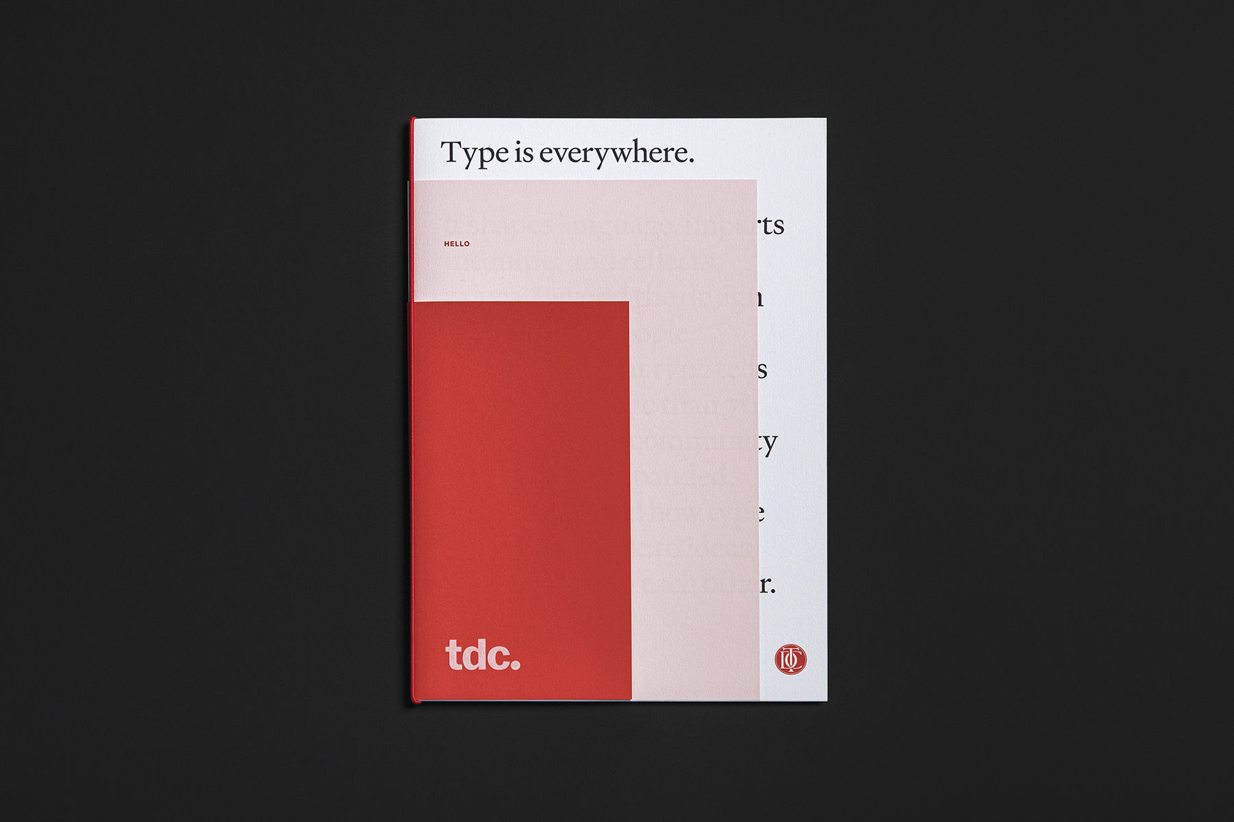
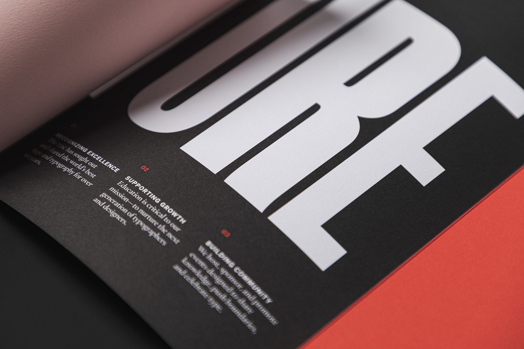
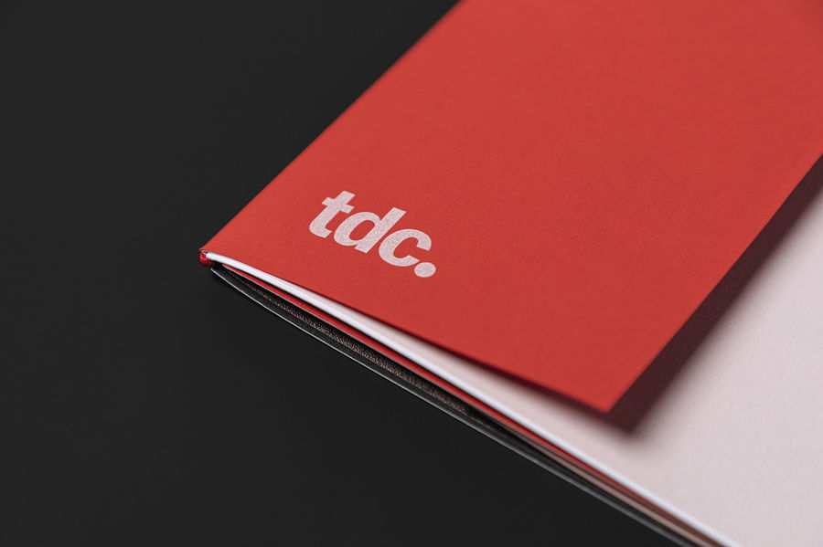
Type is everywhere. Various shades and weights of Keaykolour capture the full expressive range of Type Directors Club—from authoritative to eccentric.
Pictured Above from Left to Right
Keaykolour Vellum Chili Pepper, Pastel Pink & Pure White
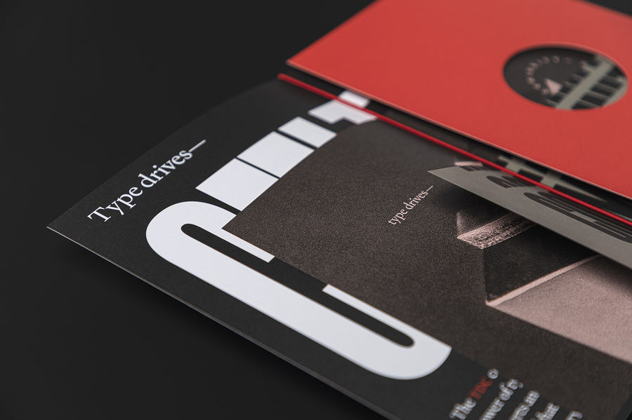
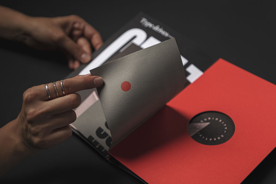
“Layered, nested text weight sheets of Keaykolour Chili, Pastel, Lichen and Pure White Cover coupled with peek-through moments reveal the many ways type affects culture, creativity, and community.”
Keaykolour Vellum
Pure White 111 Cover
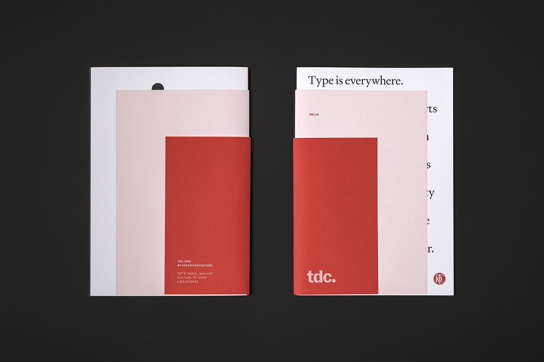
Keaykolour Vellum
Chili Pepper 80 Text
Production Notes
Designer
Firebelly Design
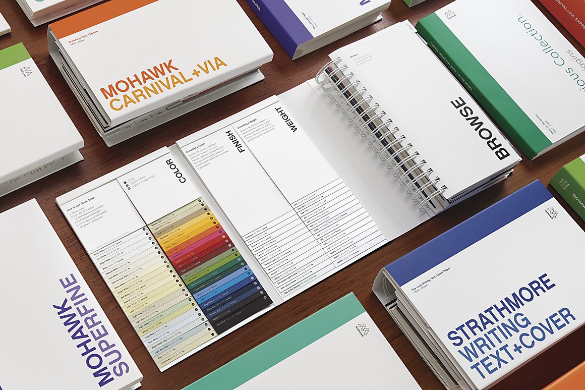
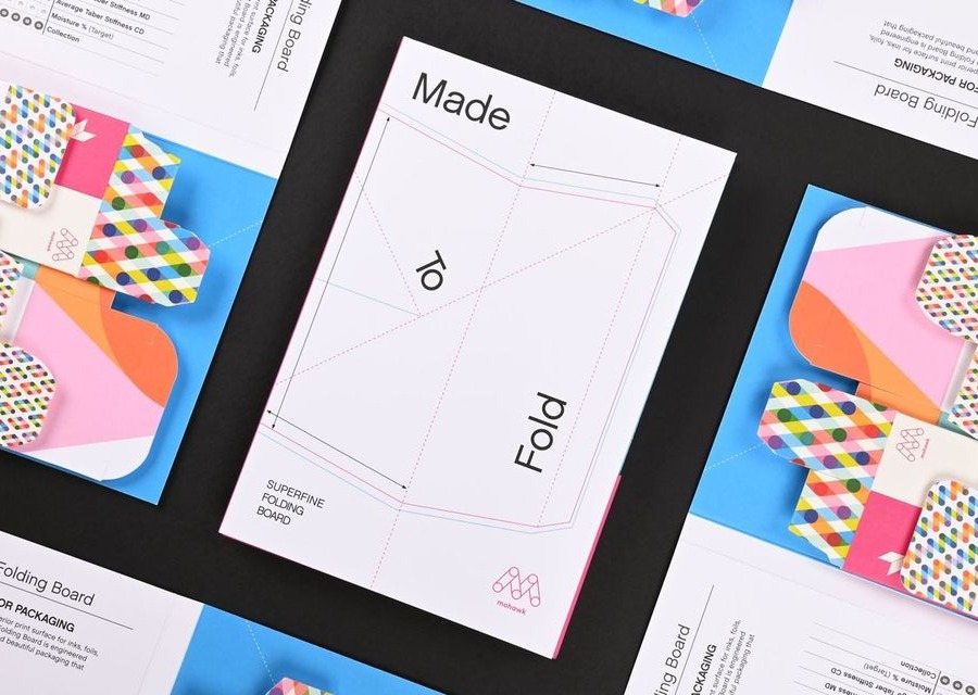
Materials Used
Suggested Articles
Mohawk Blog
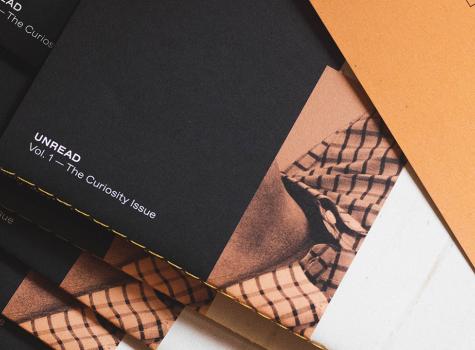
Unread by One Design is curious, creative and definitely worth the read.
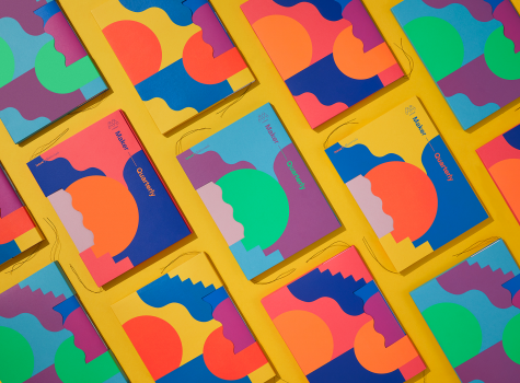
Maker Quarterly
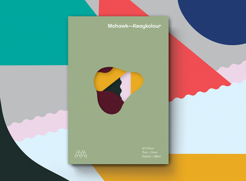
Materials are an emotional filter. Through texture, color and form, they reveal how we should feel about what we see and read.
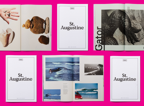
Mohawk Blog
Second in a series of “city guides,” Italic Studio created Indoek’s St. Augustine Issue featuring interesting stories, photography and a variety of colored paper.