


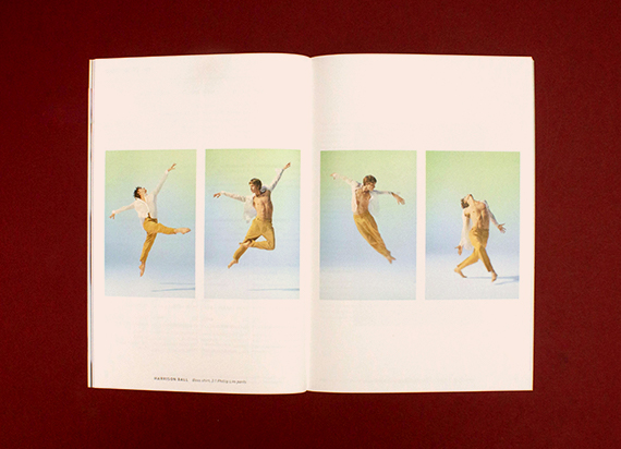
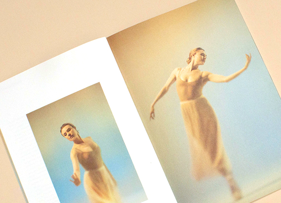
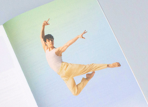
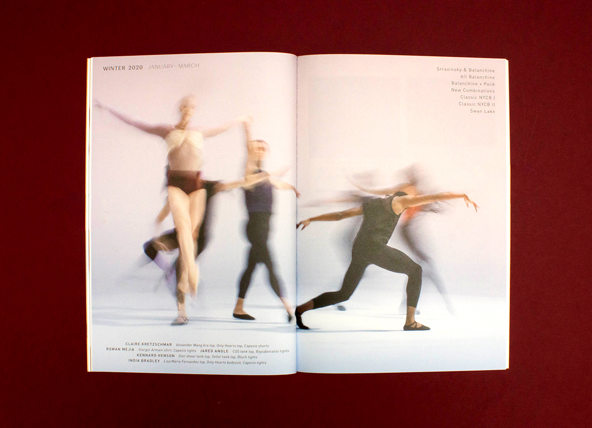
Materials Matter: New York City Ballet 2019-20 Season

The interplay of imagery and texture in print is a ballet — poetry of texture.


Production Notes
Offset Printing
A commonly used printing technique in which the inked image is transferred from a plate to a rubber blanket, then to the printing surface. When used in combination with the lithographic process, which is based on the repulsion of oil and water, the offset technique employs a flat (planographic) image carrier on which the image to be printed obtains ink from ink rollers, while the non-printing area attracts a water-based film (called "fountain solution"), keeping the non-printing areas ink-free.
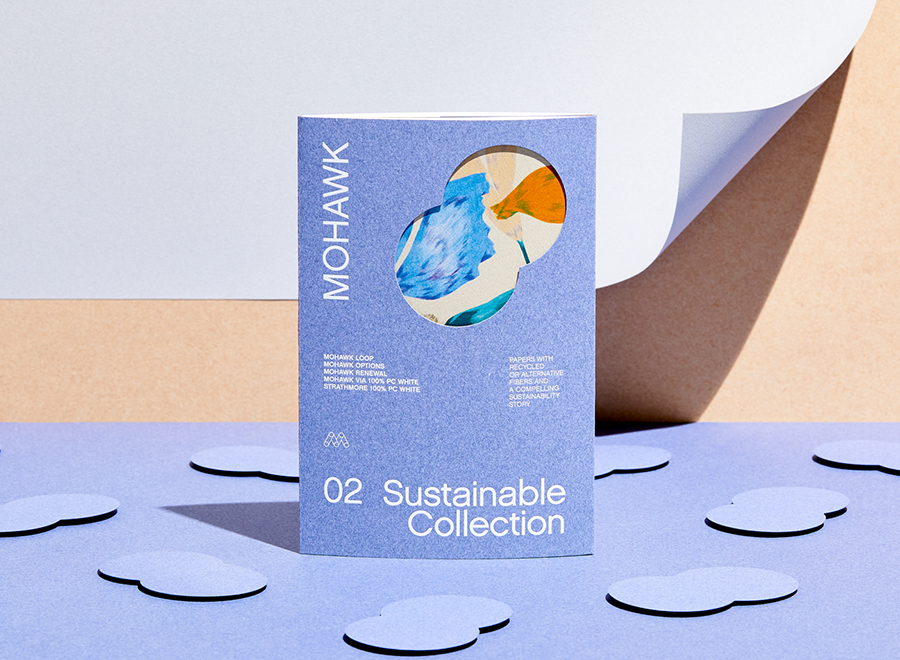
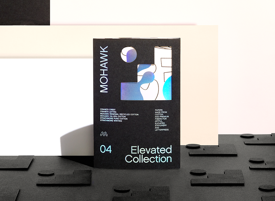
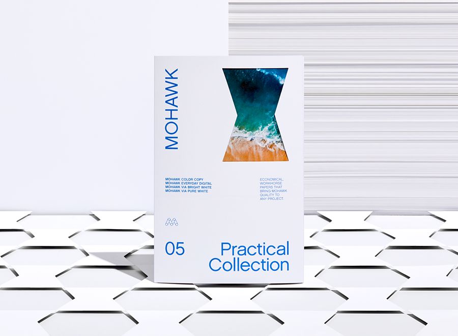
Materials Used

Suggested Articles
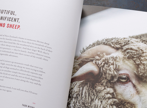
Given the Options, you'll never look at your winter socks the same way again.

Emily Cohen’s self-published book may be ‘brutally honest’ but this Superfine manual is seriously easy on the eyes.

Evoking the beach through lush, tactile paper for a luxury oceanfront residence.