


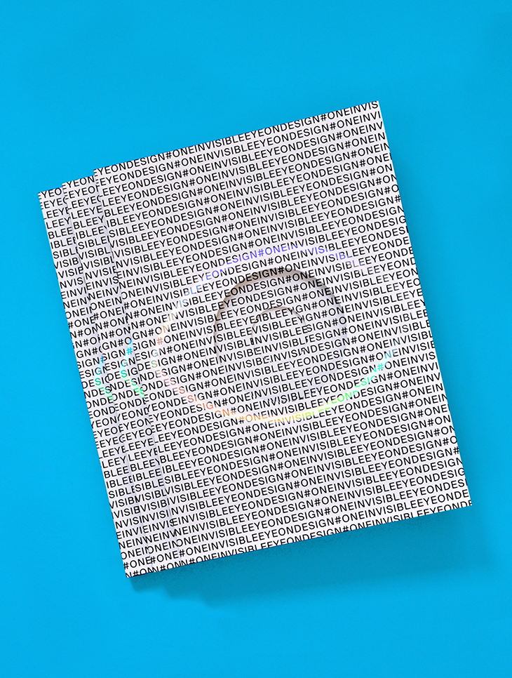
Eye on Design: From Online Publishing to a Printed Magazine
Since 2014, Eye on Design has been captivating creatives. With stories that are not only visually striking, but that highlight the world’s most influential designers and the issues that affect them, the online publication has elevated the conversation surrounding visual communication. Now, Eye on Design is available in print.
Production Notes
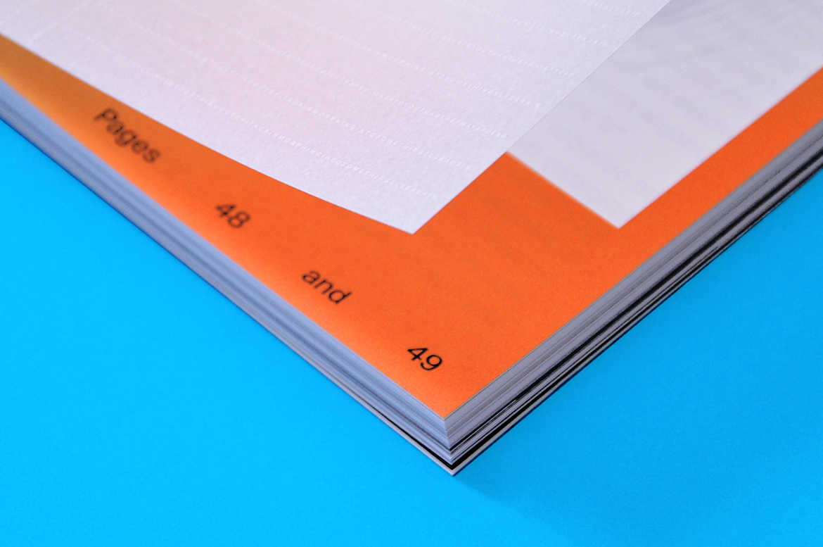
Offset Printing
A commonly used printing technique in which the inked image is transferred from a plate to a rubber blanket, then to the printing surface. When used in combination with the lithographic process, which is based on the repulsion of oil and water, the offset technique employs a flat (planographic) image carrier on which the image to be printed obtains ink from ink rollers, while the non-printing area attracts a water-based film (called "fountain solution"), keeping the non-printing areas ink-free.
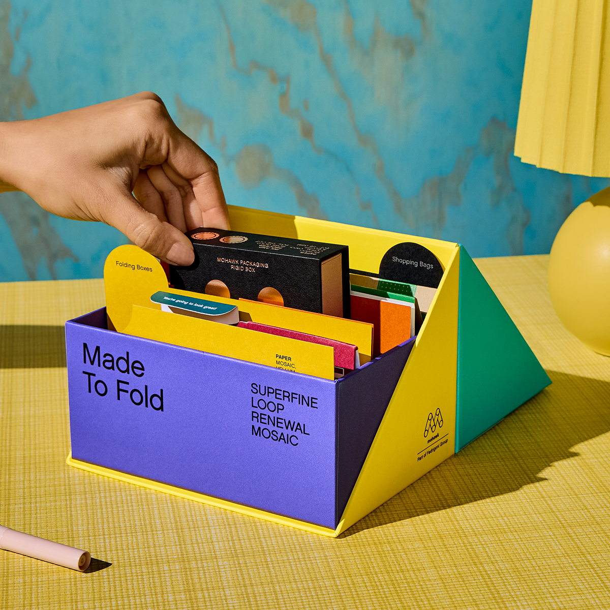
Materials Used
Suggested Articles

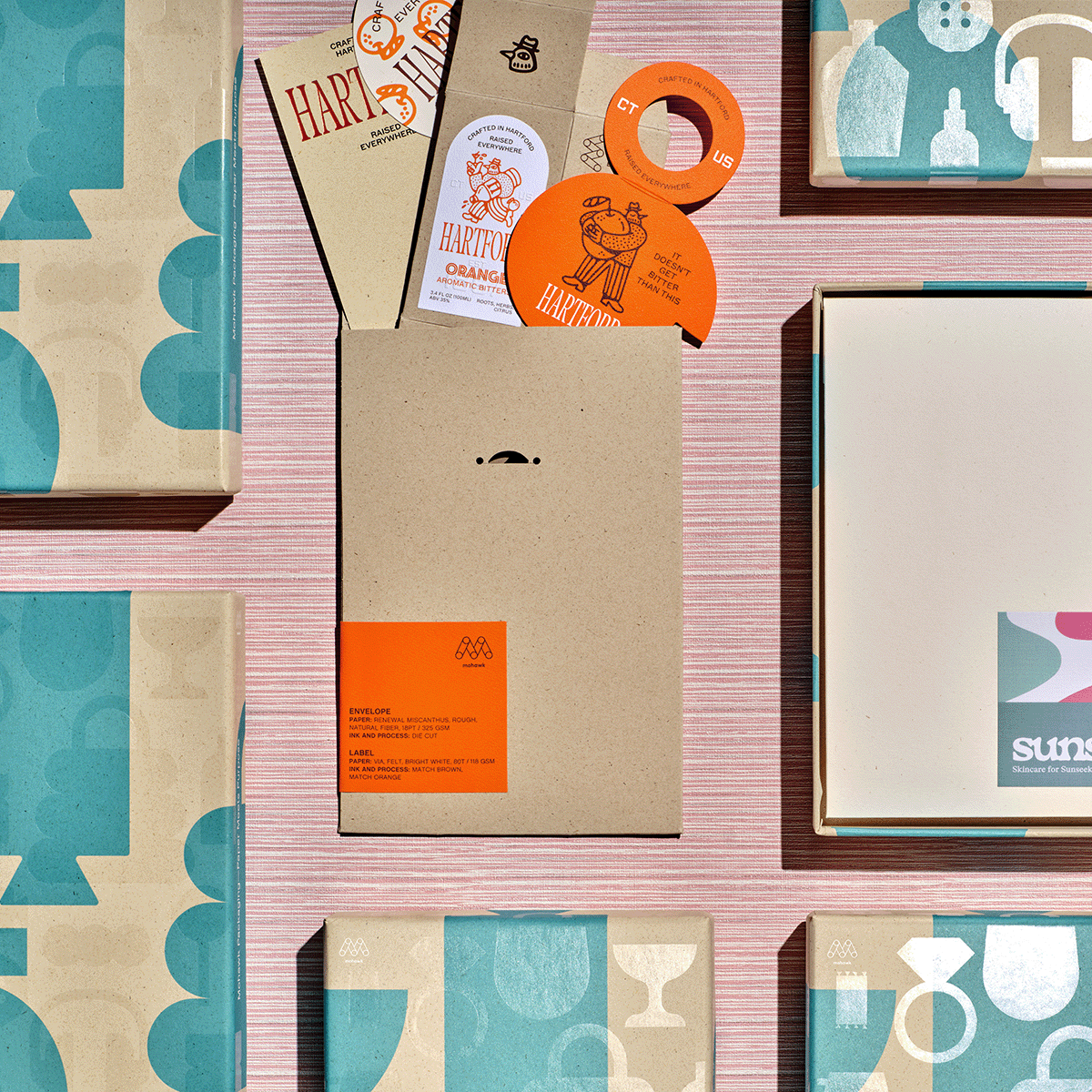
If Sunsalt is a sunlit afternoon, Hartford is the quiet hour that follows — unhurried, intentional, and crafted with care.

Sunsalt's identity is built on warmth, ease, and the quiet pleasure of a long summer day — the kind you feel on your skin long after the sun has set.
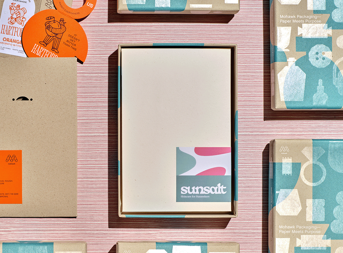
In a world saturated with digital impressions, the brands that endure are the ones you can feel.