


Mohawk Blog
BassamFellows Catalog: The Artistry of Black & White Imagery
Words
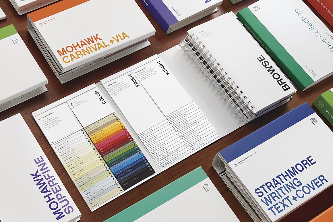
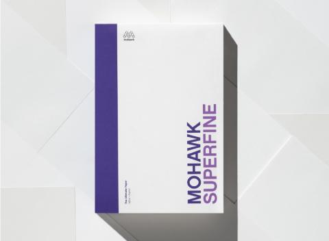
Mohawk
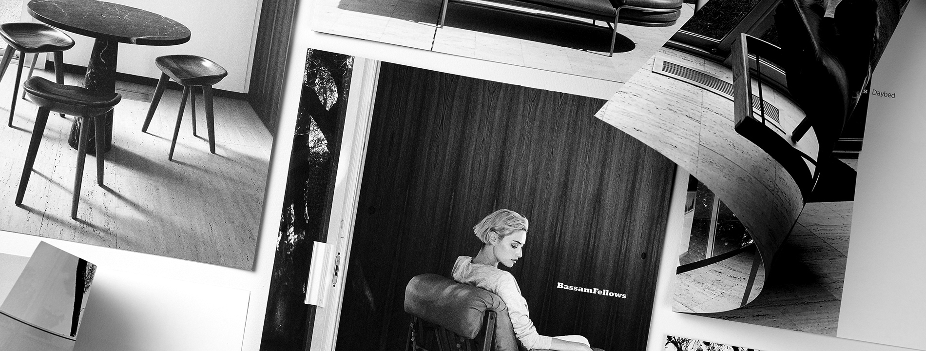
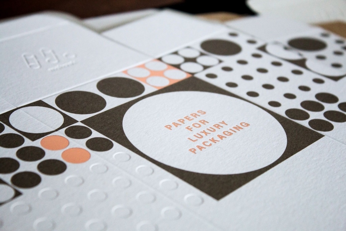
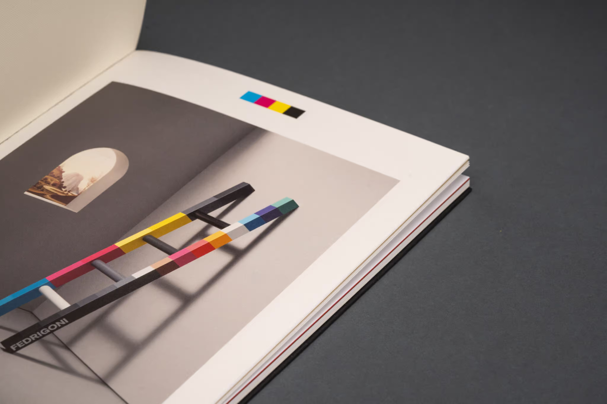
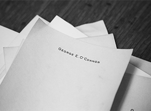
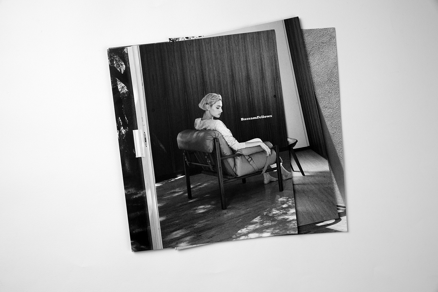
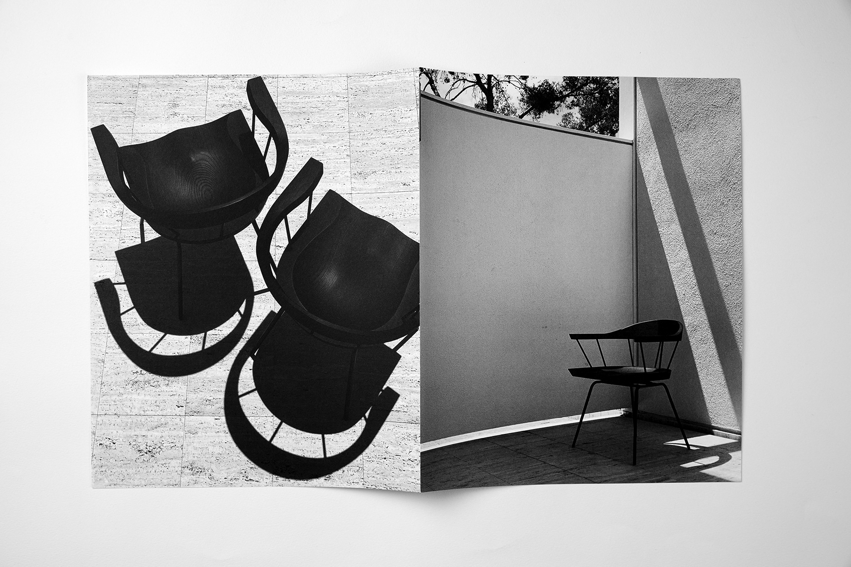
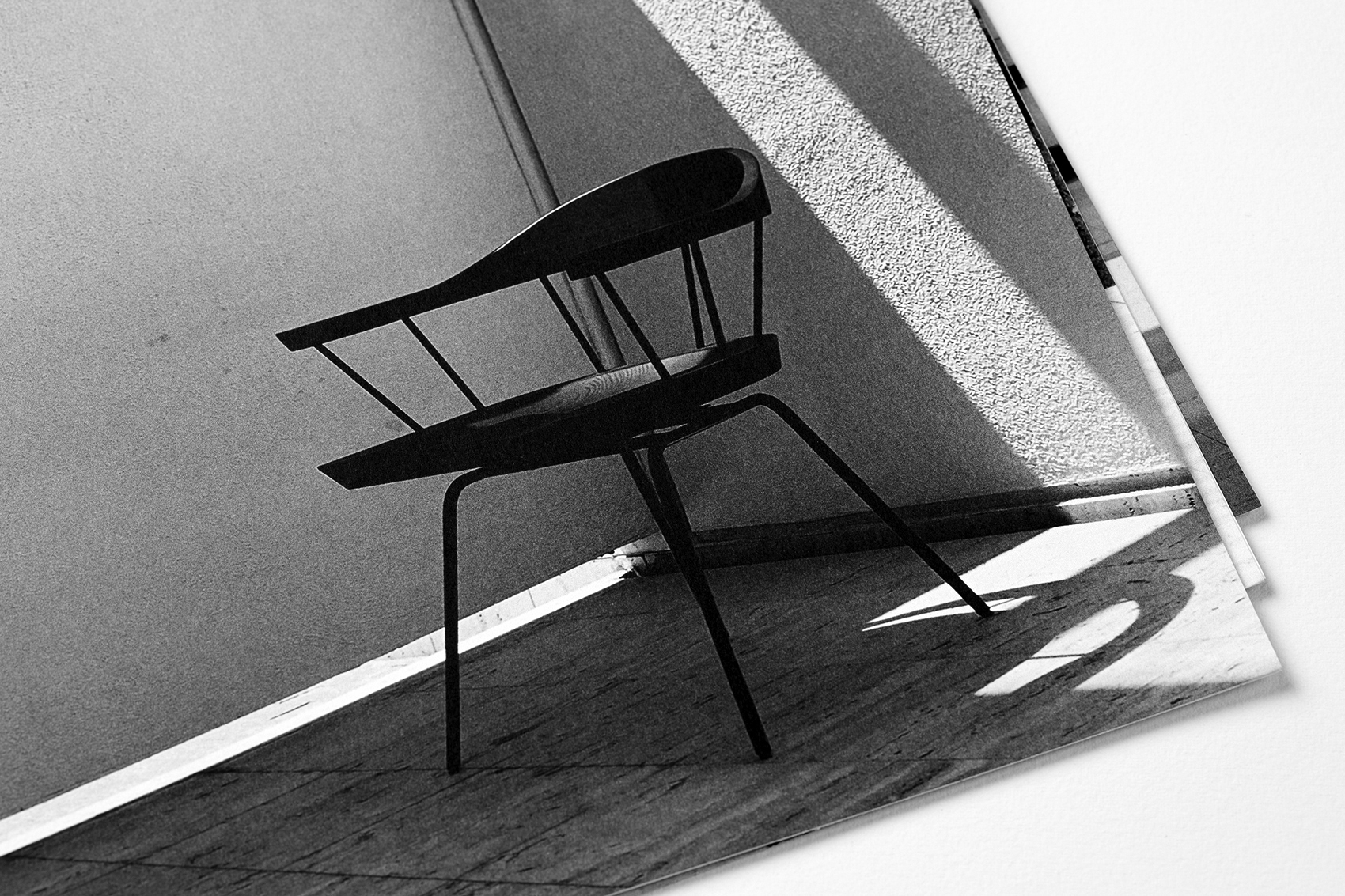
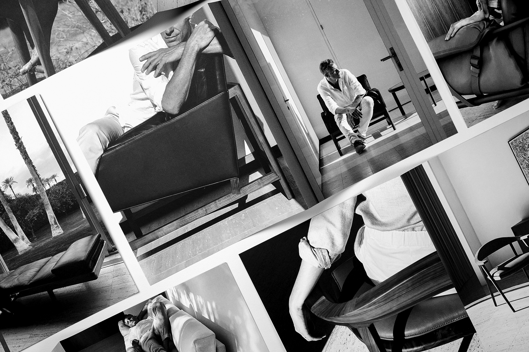
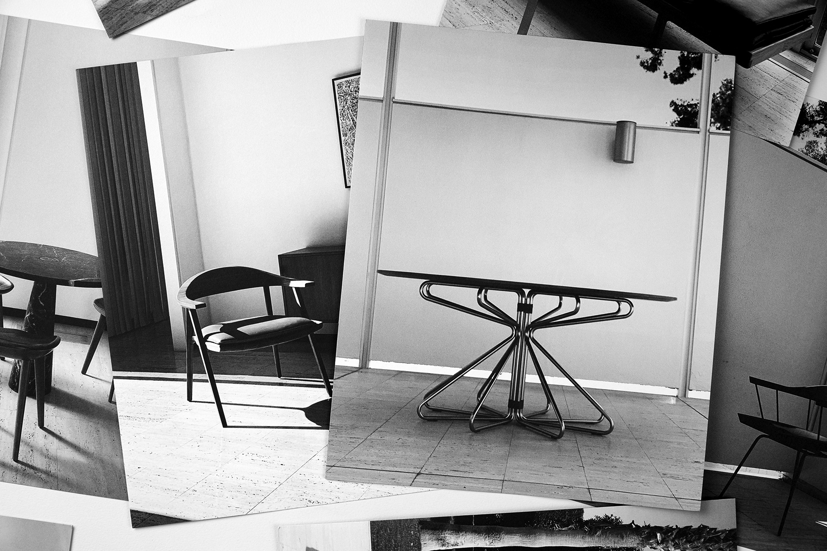
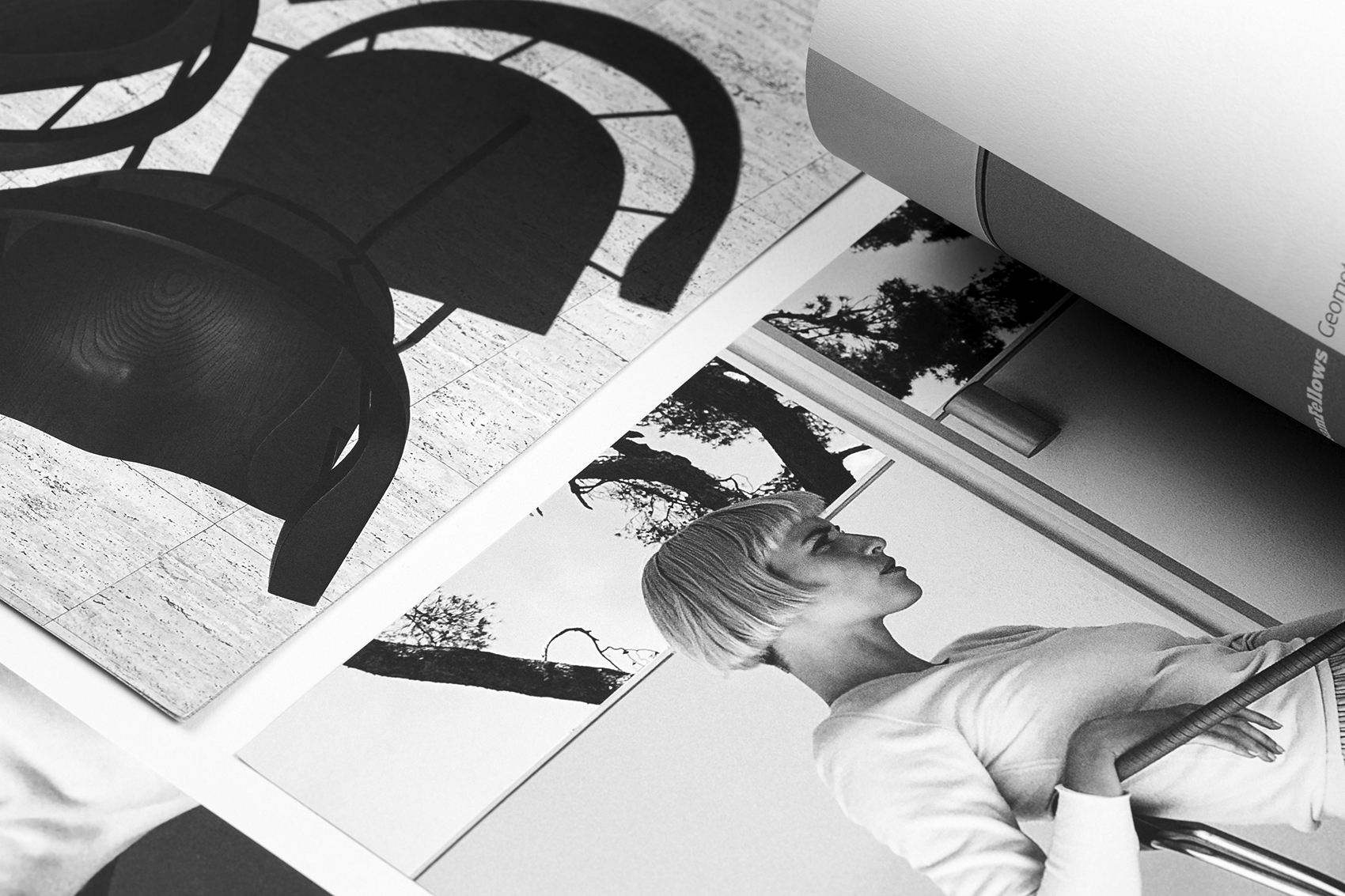
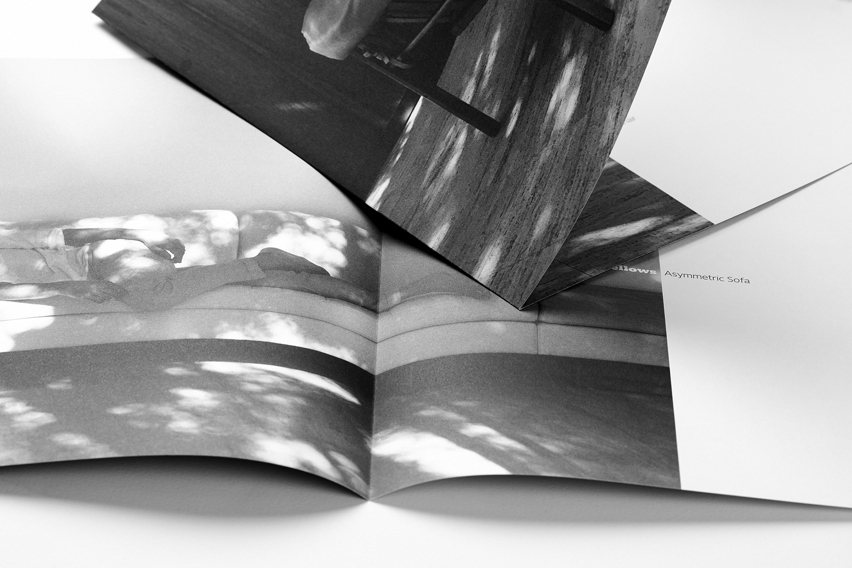
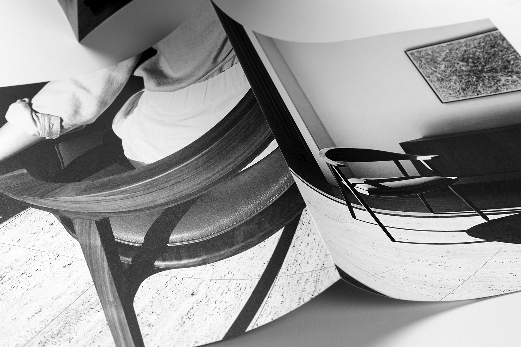
Artful black and white photography, printed as duotone images are reminiscent of vintage silver gelatine photographic prints.
“Superfine has been trusted by generations of designers as the ultimate printing paper for their most important projects, including lush black and white photo reproduction.”
Chris Harrold
SVP Marketing + Creative, Mohawk
Press Sheets
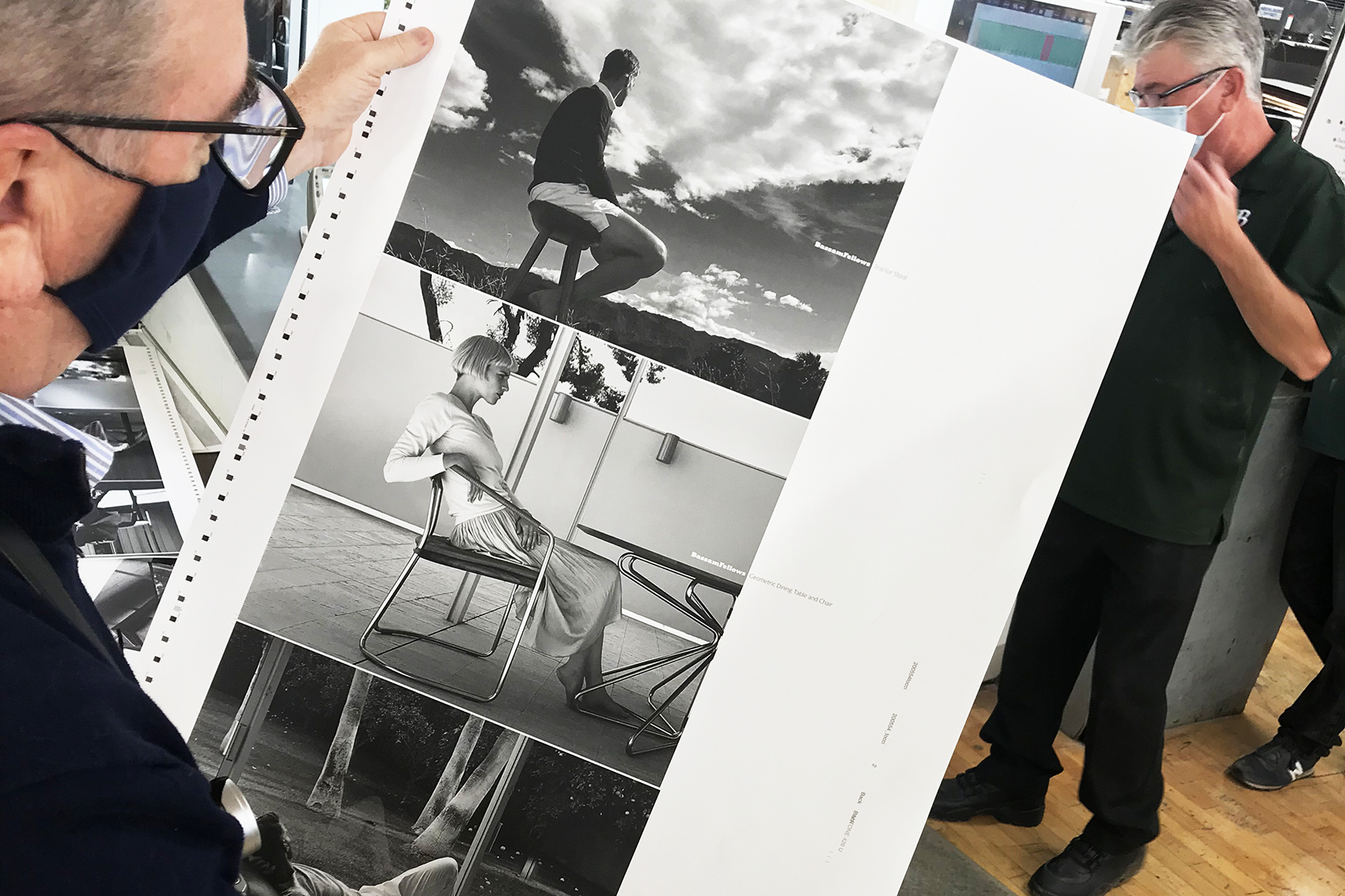
Brodock
Printed Catalog
BassamFellows
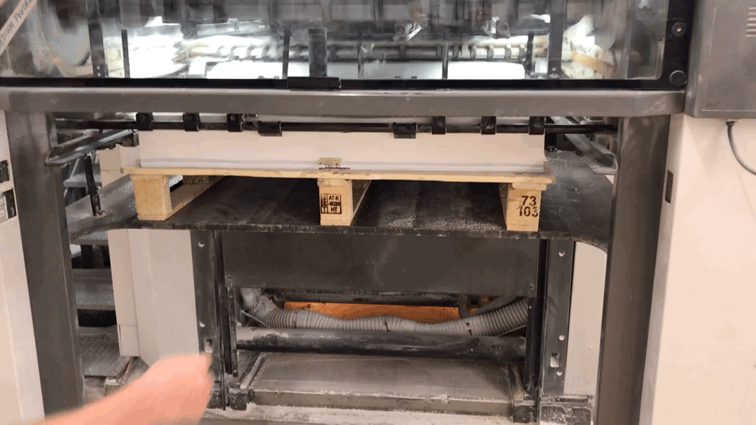
On Press
Brodock
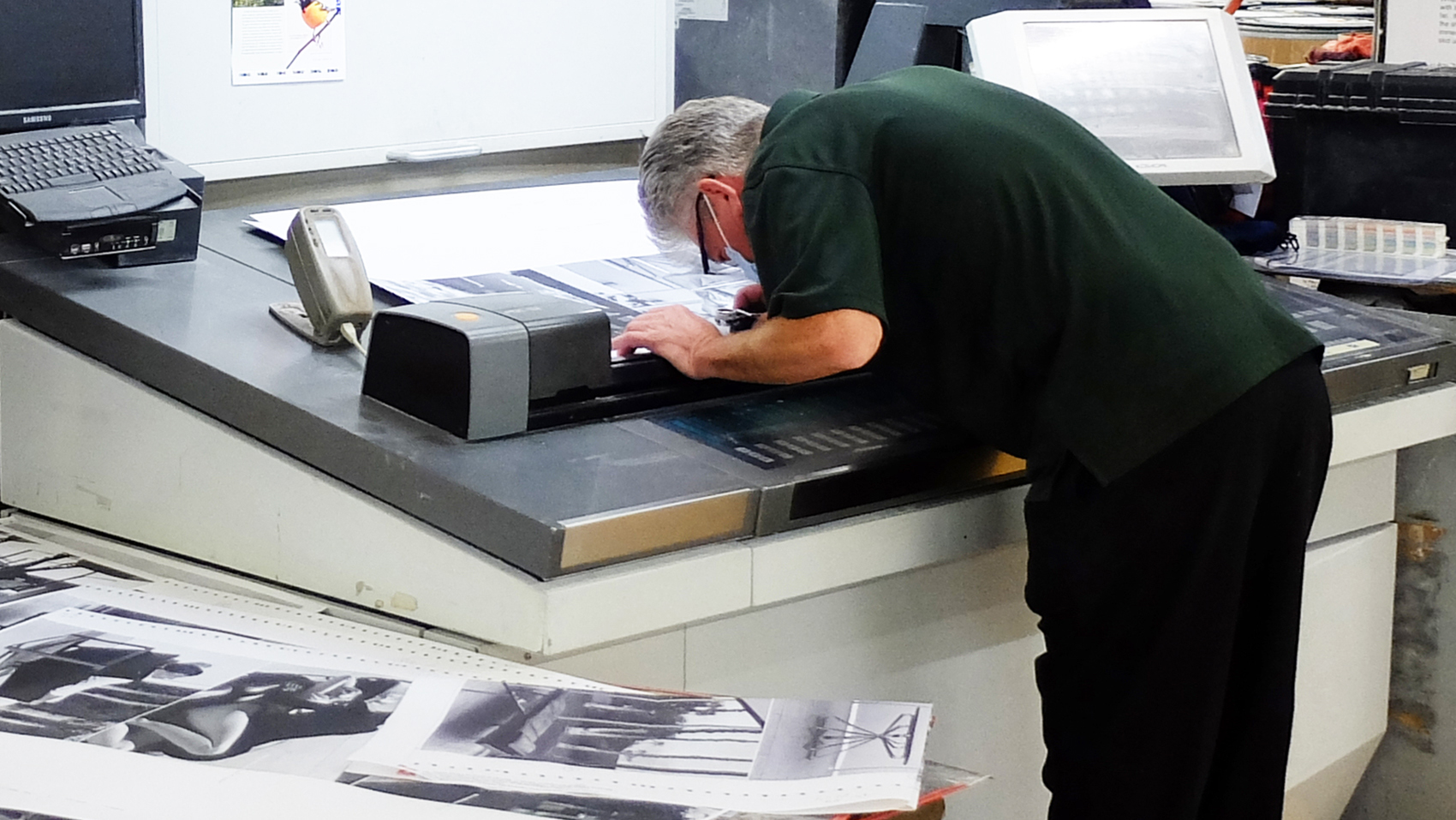
Press Test
Brodock
“We wanted to get the quality, that beauty, and that materiality with the paper that we have in our own product. I think that's a way to communicate our brand values as well — the touch and feel of the actual catalog.”
Scott Fellows
Creative Director, BassamFellows

Production Notes
Printer
Designer
BassamFellows
Materials Used
Suggested Articles
Mohawk Blog
Paper choice can influence the way we experience photography in a printed piece. Lightly colored paper can elegantly shift the tone of an image, while subtly textured paper can make a big statement. Have you ever thought how choosing the right paper can add a unique and surprising layer of interest?

Mohawk Blog
Imagine two lunch spots: a cafeteria and a restaurant. Each serve their own purpose, but which one would you bring a client or first date to?
Mohawk Blog
Materials speak, materials communicate – are your materials on-message? The paper and process(es) you choose says a lot.