


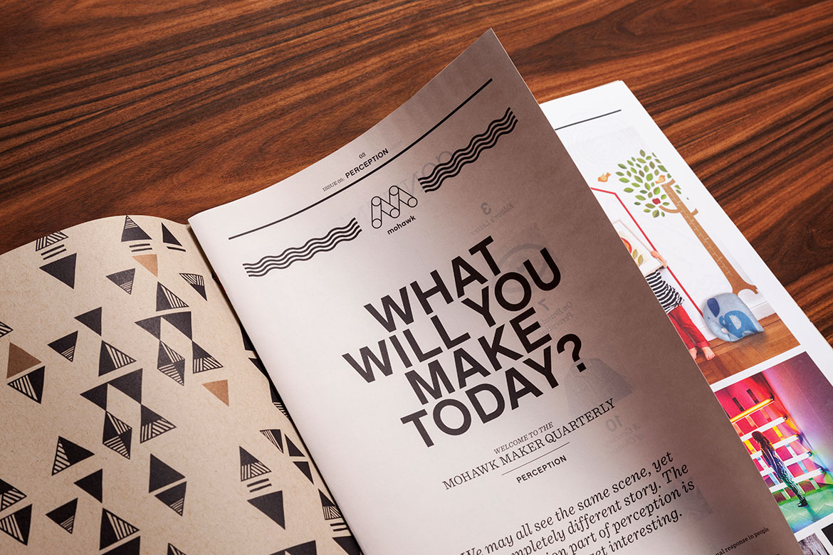
Mohawk Maker Quarterly Issue #5: Perception
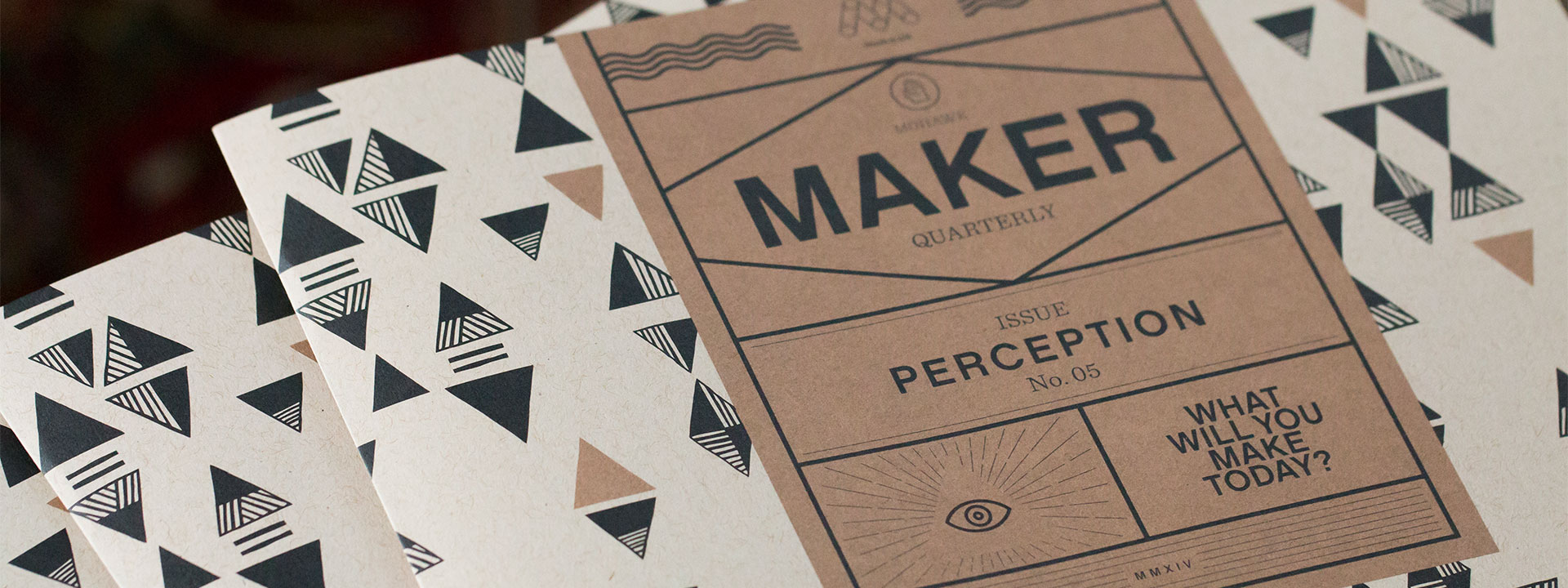
Merriam-Webster Dictionary broadly defines perception as, “the way that you notice or understand something using one of your senses.” Issue #5 of the Mohawk Maker Quarterly explores the influence of art and design on perception.
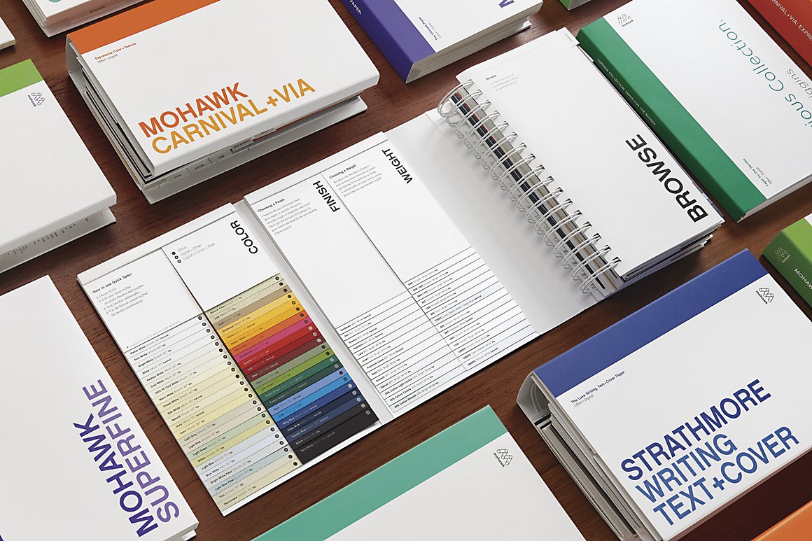
Production Notes
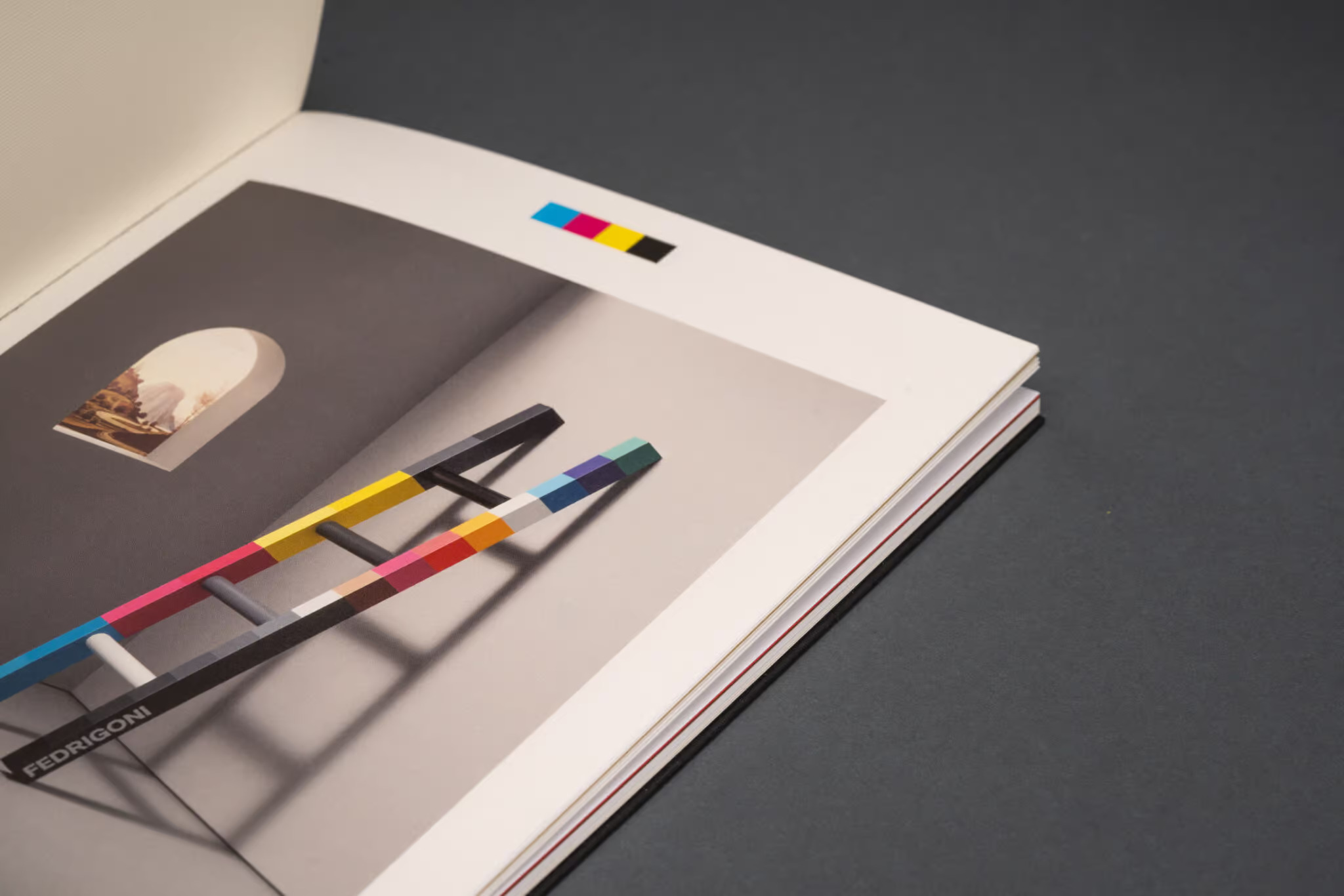
Offset Printing
A commonly used printing technique in which the inked image is transferred from a plate to a rubber blanket, then to the printing surface. When used in combination with the lithographic process, which is based on the repulsion of oil and water, the offset technique employs a flat (planographic) image carrier on which the image to be printed obtains ink from ink rollers, while the non-printing area attracts a water-based film (called "fountain solution"), keeping the non-printing areas ink-free.
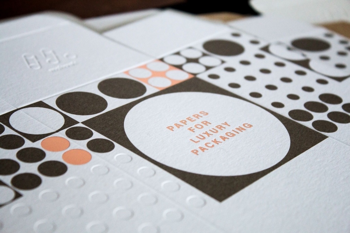
Metallic Inks
Metallic powders in a varnish base create images with metallic luster. Leafing inks which have metal flakes that rise to the top of the ink mixture have more shine, but increased rub off. The metal flakes in non-leafing metallic inks sink down with less rub off and a little less shine. Non-leafing inks with a dull varnish or aqueous coating perform most reliably on uncoated paper.
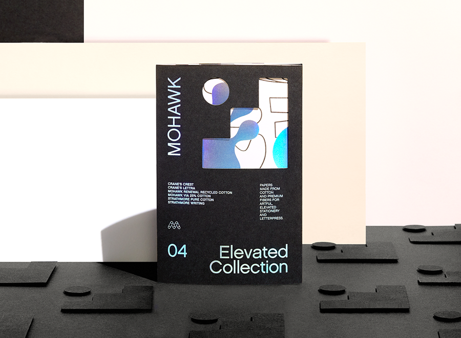
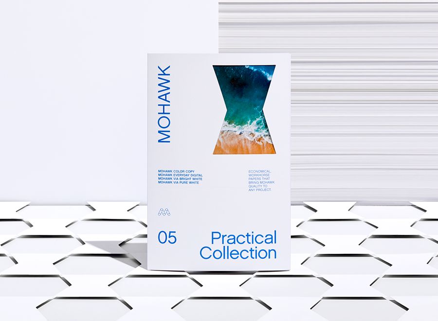
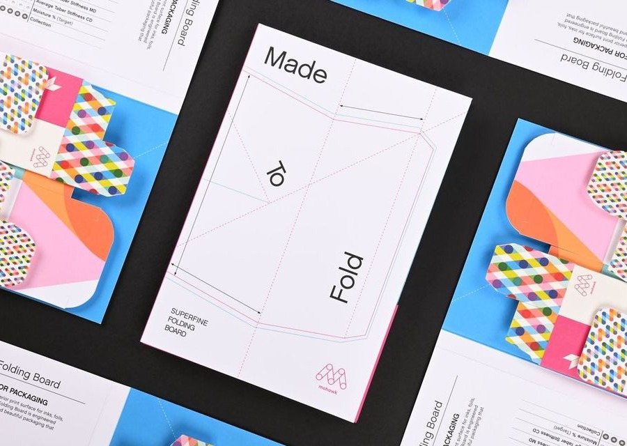
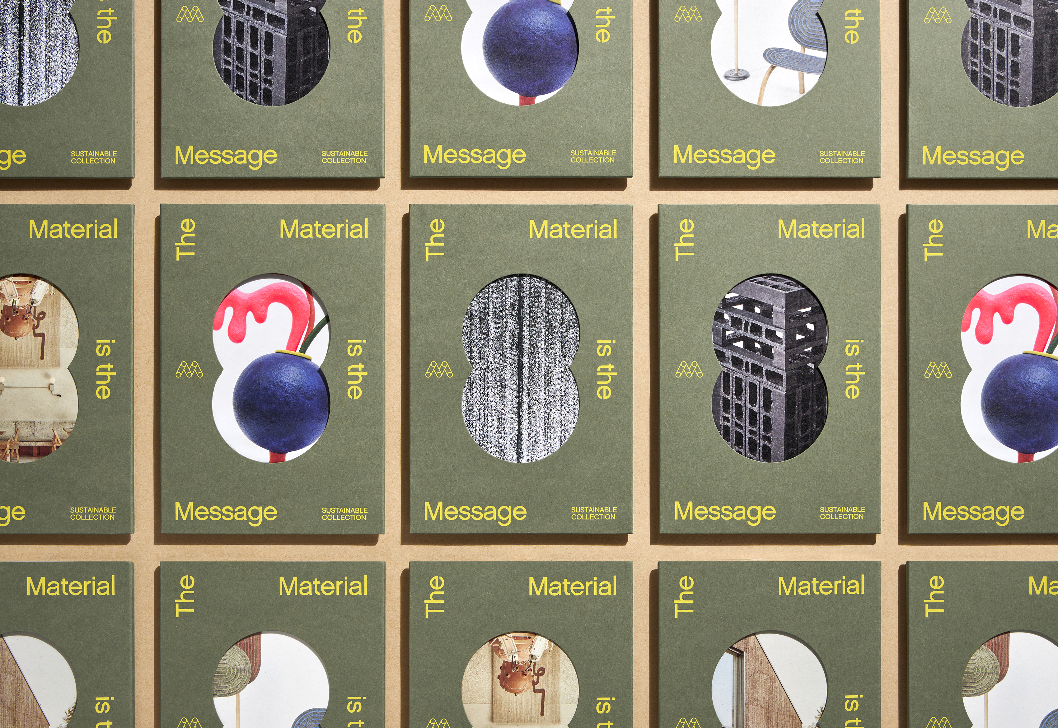
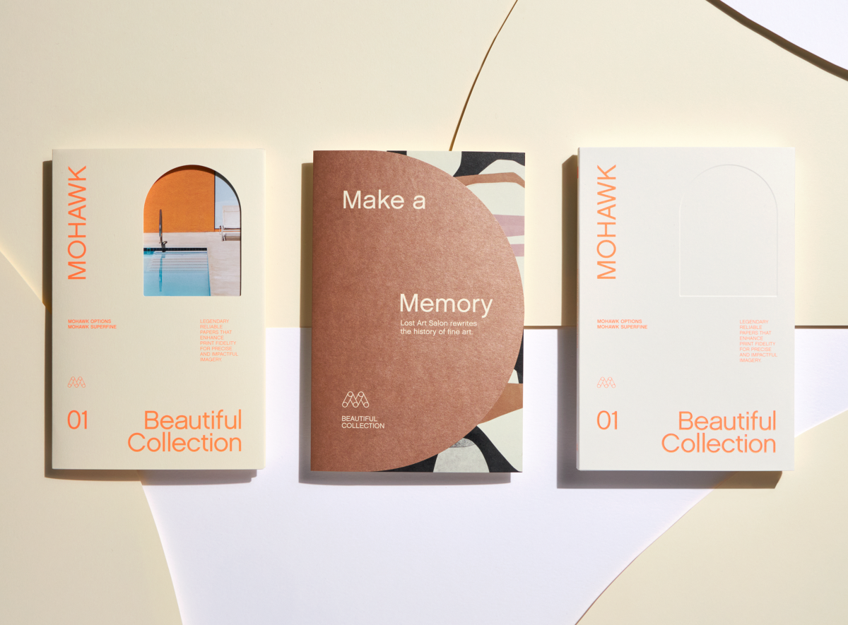
Materials Used
Suggested Articles
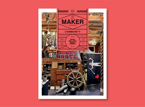
Craftsmanship and attention to detail define excellence in any discipline. The third issues of the Mohawk Maker Quarterly and the Mohawk Craft Cooperative focus on the importance of the details, one of Mohawk’s core business beliefs.
We’re more successful when we share knowledge, resources and information than by going it alone. Partnerships are important, and humans crave interconnectivity and sharing. By connecting with our peers and seeking collaboration, we create new opportunities for growth and learning.
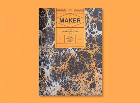
Mohawk Maker Quarterly issue No. 06 explores the concept of impressions and how, whether tangible or abstract, our reality is formed by the impressions we make and take.